
JUNIOR SHOWCASE
Educational Entity
Students created a brand experience for an educational entity or subject of their choosing. They also ‘pitched’ this project like a freelance assignment: they created a proposal, then developed two visual approaches for their entity and then, once one direction was approved, they created digital and print expressions of the final brand.


Hand in Hand App

Hand in Hand Website
Erika Sheehan
We were tasked with developing a design system that revolved around an educational product. As Vice President of the Jefferson American Sign Language (ASL) club, I chose to embrace my current knowledge of the language and create an educational entity around teaching ASL. My brand Hand in Hand is dedicated to teaching ASL in a unique fashion, making each experience and lesson planning, through our app, customizable to the needs of the user. An onboarding experience will allow the app to understand them and curate lessons specific to their ASL learning needs. This customization is unique to Hand in Hand, as other existing Sign Language apps all start at the same, basic level, not allowing users to get their needs met without learning unnecessary information.


Ashley Anousaya
Trends in make-up makes personalization difficult. People follow trends without accounting for face shape, eye shape, etc. This becomes an issue for people who are not the “standard beauty type” and are not represented in these trends. This application and magazine provides the opportunity for a more personalized approach to make-up. Utilizing AI to discover face and eye shape along with the chance to chat face-to-face with others on how to complete looks helps make-up become more of a community oriented industry.


Alex Pessolano
For this project we were tasked with creating an educational entity which is a brand or product that teaches people about something or how to do something. My project is called bloc and is a website that teaches people about everything that has to do with concept art and the profession itself.


Autumn Small
For this project I was tasked with creating an educational entity, in my case I created Unveil which is an app that teaches people about the ingredients in their makeup. What separates Unveil from other platforms that tackle this same topic is that we are REAL, we provide REAL facts to REAL people and allow them to formulate their own thoughts without inserting our own. Through our partnership with Sephora we are able to reach a larger audience and also enhance the shopping experience, allowing consumers to learn about their makeup before they even purchase it.


Rewind App
Daymond Chan-Green
The purpose of the project was to create an educational branding experience and propose the brand as if I was pitching it as a freelance designer. I created a brand called, REWIND, and the goal of REWIND is to educate the old and new generation on the music history across various cultures in the world.


Daniel Gentner
In a world of rising food costs and costly on demand food delivery apps, there is an opportunity to create a community-powered, cooking app for beginners. Oli, a free and easy-to-use cooking tutorial app featuring recipes contributed by home cooks in the local community.


Emma Maddaluna
The education entity project is about teaching an audience something. I decided to create Gleam, an app made to help you navigate concerts, because of my love for music. With this in mind, there is an opportunity to create a space with venu directory and concert safety to be easily accessible.Curated by the company and venues, Gleam helps make going to a concert less stressful. The app can teach you about the area and give recommendations to kill time as well as navigate the venue itself.


Herblab Mobile App

Herblab Social Media
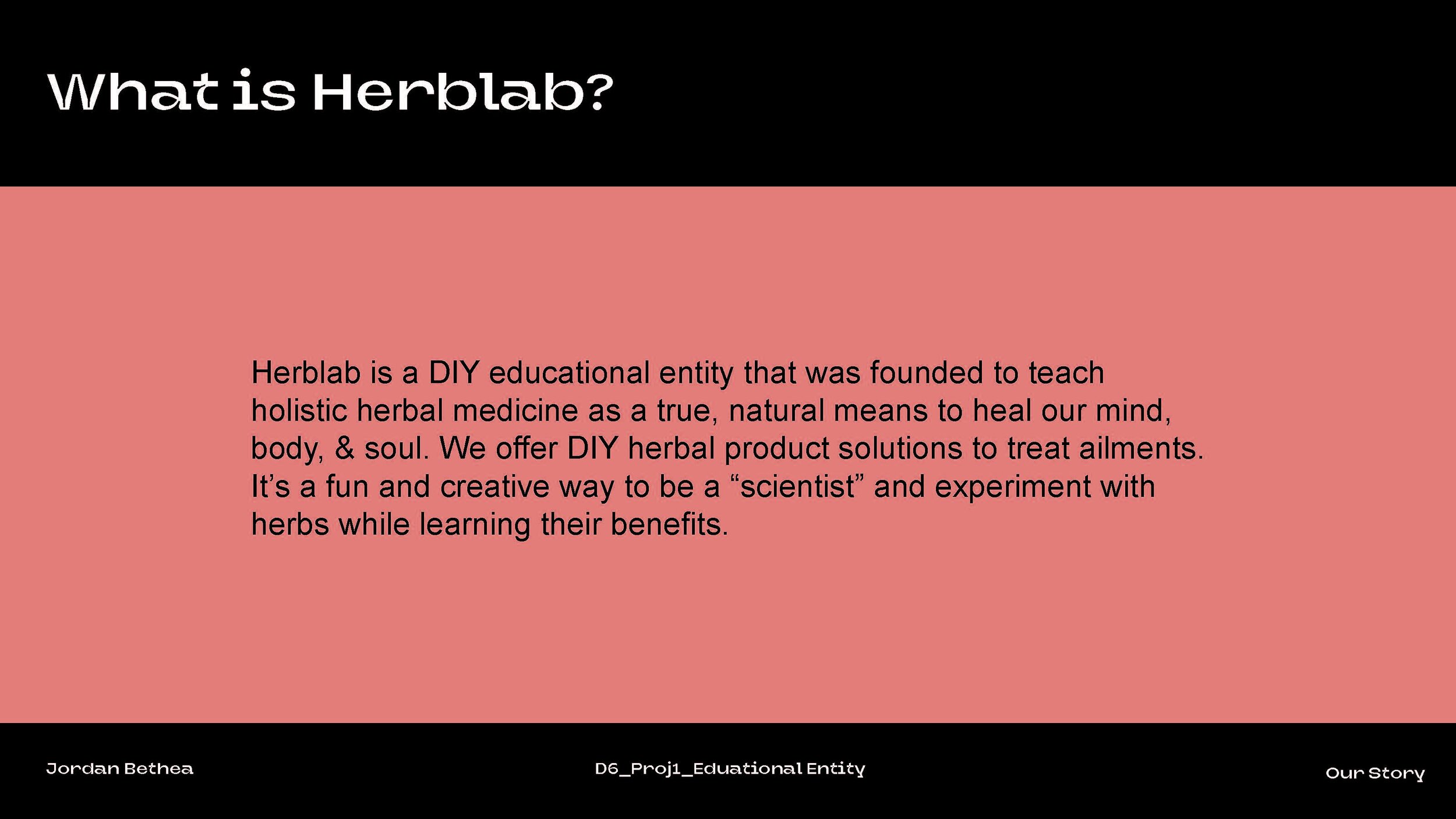
Jordan Bethea
This project involved creating a brand experience for an educational entity or subject of our choosing. I created the brand Herblab, a DIY educational entity that teaches holistic herbal medicine as a true, natural means to heal our ailments as opposed to readily accepting products and ideas we are used to. My process involved sketching, brainstorming, moodboarding and research on herbal holistic remedies and products. I believe my design system successfully communicates both the ‘herb’ and ‘lab’ sides of Herblab through the use of earthy colors and defining the ‘mad scientist’ aesthetic through using metallic, whites, and grays and lab materials to convey the feeling of a lab.


Matthew Bayer
For the Educational Entity Project, I created a brand called Pixel Palace that provides a physical venue for customers to go to and play video games. Professional lessons are available for serious and competitive gamers, while food and drinks are also for sale.


MJ Carafa
Over the last two decades SIFT has brought together hundreds of space enthusiasts, governments and organizations to a yearly symposium, with the goal to diminish and dispose of our space footprint. SIFT strives to make a change towards a cleaner future. Doing so by educating the public and supporting the process to SIFT through space junk and debris. SIFT has been planning a space cleanup for the last two decades. Through countless trials and testing; and the support of 200,000 plus donators.


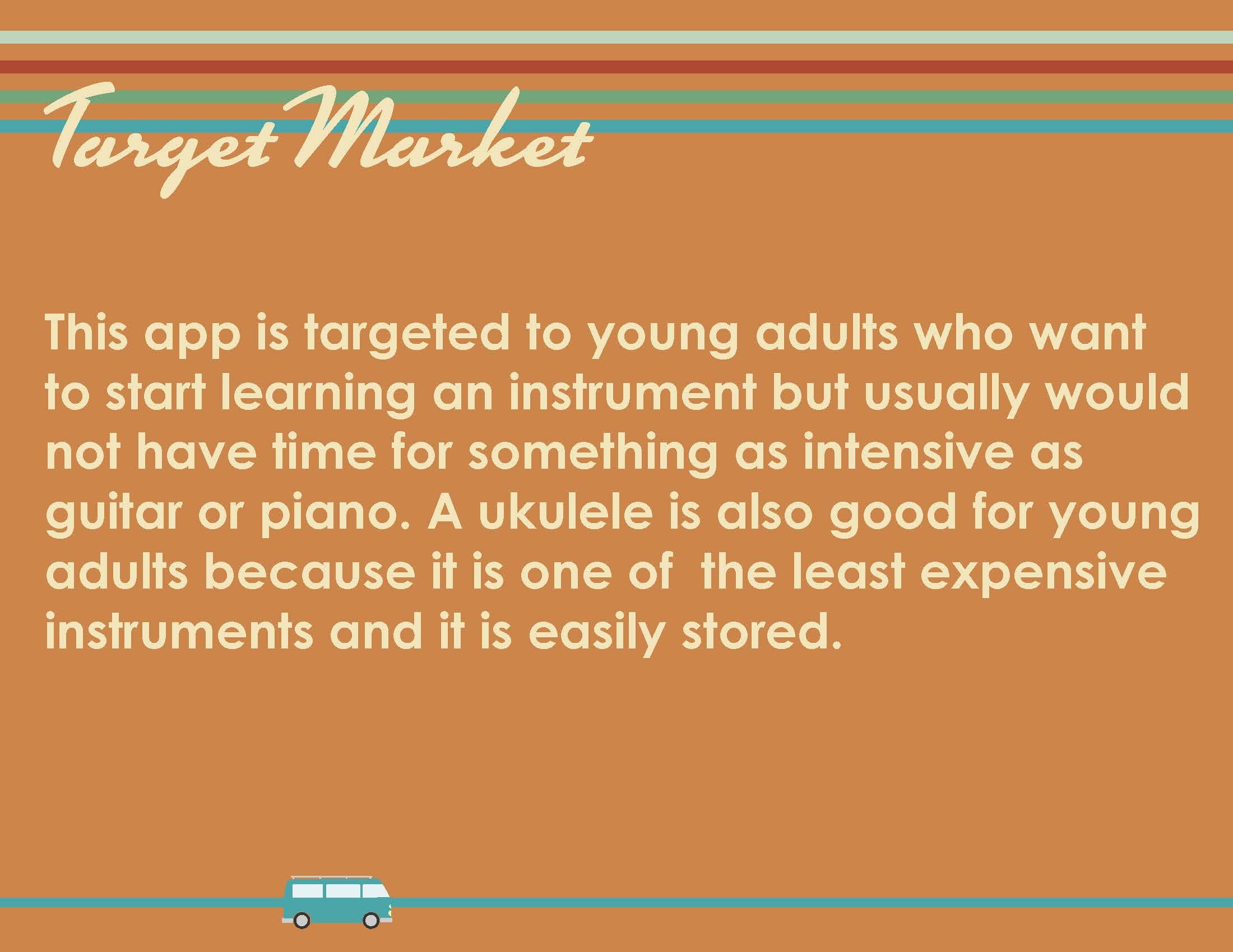


Maura Fallon
For this project, we were assigned to create an educational entity. My project is called ClubUke. It is it an app designed to help people of all skill levels play the ukulele. I also created a chord book as well as posters.


Samantha Barkholz
We were tasked with creating and branding an educational entity, so I focused on my passion for Astronomy. There isn't very centralized places and experiences of our stars and beyond so I wanted to create that journey and story to go through the history of Astronomy. My designs and thought process all connects and continues to lead through my designs in my book, web design, and more in elements such as a connecting yellow line.


Nicole Mambuscay
Our mission is to create a community of cultured sneaker enthusiasts while continuing to educate and encourage creativity. Kultur’d pays tribute to the sneakerhead subculture and sneaker enthusiasts through its aesthetic, inclusivity, and education.
Event Branding
Project description


Ashley Anousaya
Rìyè is a new Asian Food Festival running through the month of May, celebrating & supporting the Asian American Pacific Islander (AAPI) community in Chinatown, Philadelphia! We have paired with SPOC, AAU, and AAI in order to bring awareness to the Saving Chinatown movement. Accompanying the festival is a digital food passport for featured vendors with the opportunity to win merch. Rìyè is an experience that completely immerses audiences in the rich culture cultivating a sense of community that deserves to be saved.


Alex Pessolano
For this project we were tasked with creating a festival and tackling a problem along with the festival. For my project I created a game convention centered around nature and conservation. The charity I paired with was Computers for kids which is an organization that refurbishes old computers to give younger less fortunate kids access to them. This also helps fight E-Waste by keeping the electronics out of trash.


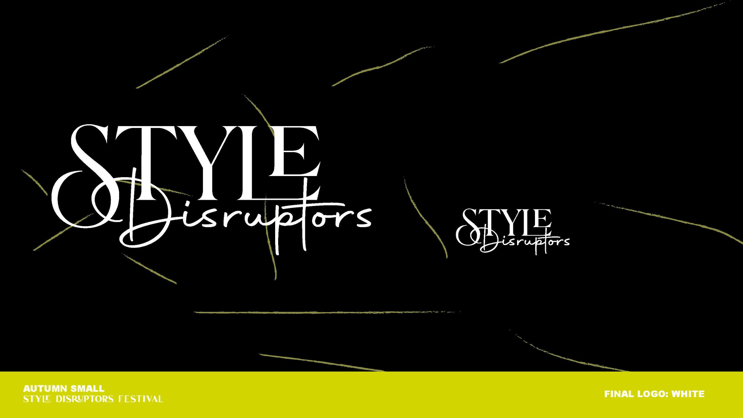


Autumn Small
I was tasked with creating and developing the branding for my very own festival. The idea I came up with was Style Disruptors, a festival geared towards ushering in new/upcoming fashion designers that are not following the trends and just being themselves. New would be the best way to describe the Style Disruptors Festival, it is not the fashion innovators and hopes to create a sense of community in an industry that isn’t always the most inviting. For this reason we have some of the top designers and creatives in the industry come and share their expertise and provide a sense of mentorship. Most importantly, Style Disruptors is supposed to be fun!


Daymond Chan-Green
The purpose of the project was to design an event branding experience and I decided to create a festival for children ages 4-10 years old that focused on the theme of dinosaurs. The Brand I designed is called ROAR AND EXPLORE, and this festival offers a wide range of interactive activities for children to learn the history of dinosaurs through STEM related events.


Daniel Gentner
Polżynki Street Festival is a weekend long event held in Port Richmond, Philadelphia benefitting those suffering from the war in Ukraine through humanitarian aid donations and compassion among the local community. The festival is focused on bringing awareness back to the war abroad, and how festival-goers can make an impact.


Emma Maddaluna
Geared to raise social awareness of pollinators and the positive impact they have to our flower population FloraCulture is made to bring the organic nature of flowers into the gridded city living of New York City. FloraCultures focuses on promoting native plants and bringing recognition and fascination into city living.


Erika Sheehan
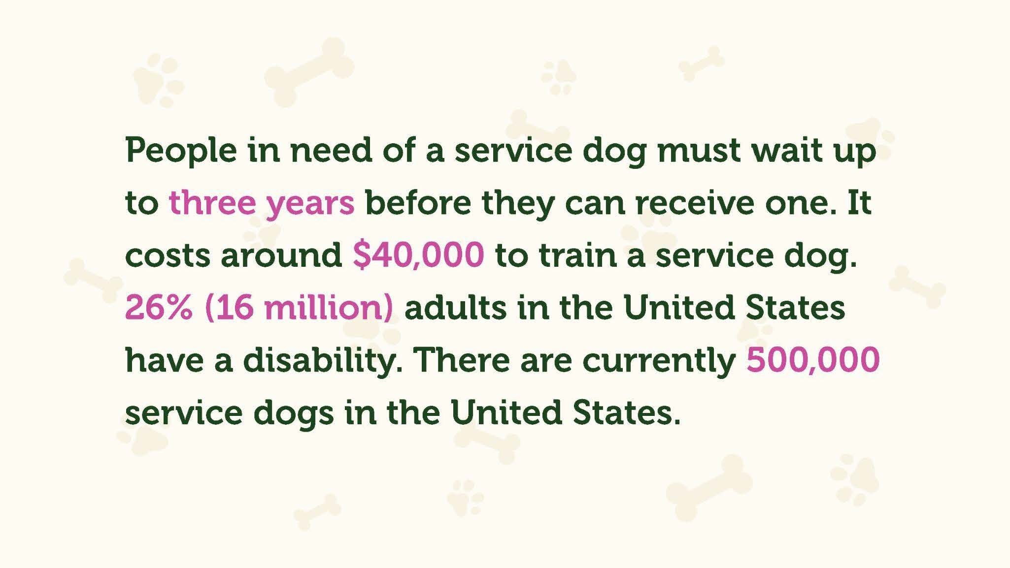
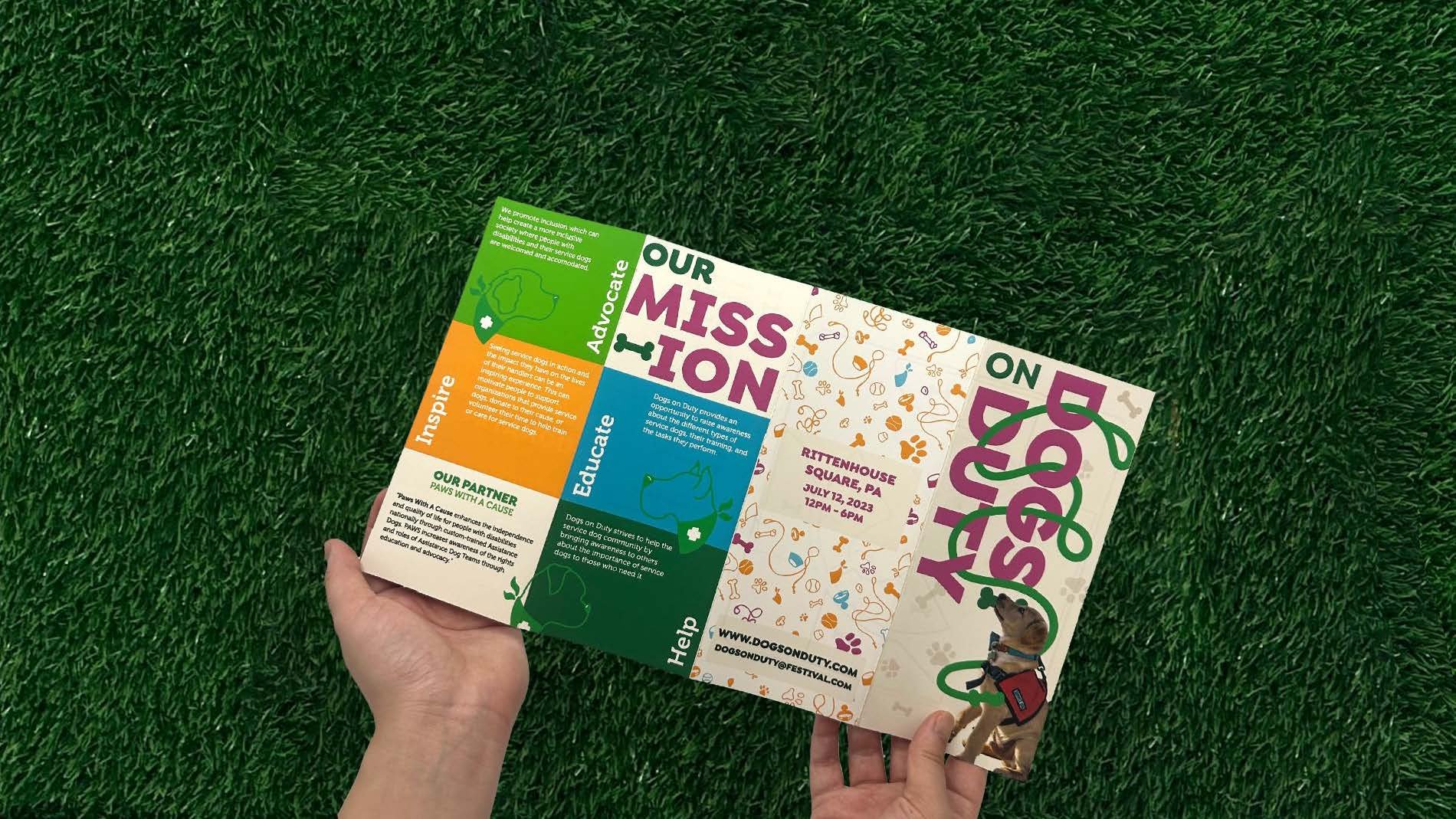
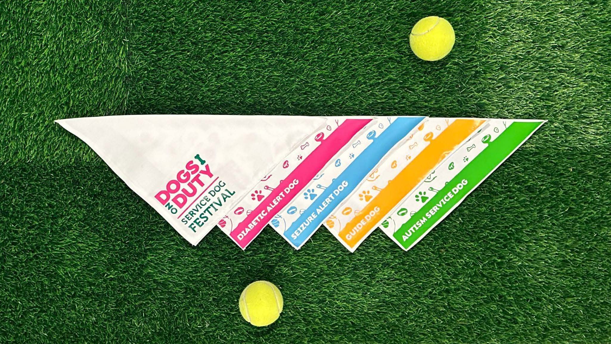
This project is an event branding, with touchpoints created to extend the brand system from user interaction before, during, and after the festival. I created Dogs on Duty: A Service Dog Festival, dedicated to educating, advocating, inspiring, and helping the service dog community. It also caters to those interested in the training process that is performed in order to place a service dog in the hands of its owner, to forever change their lives. Dogs on Duty is created to combat the expenses of training and reduce confusion in the process of trying to receive a service dog. Festival goers will come to Dogs on Duty and leave inspired by the journeys of the speakers and the amazing work of service dogs.


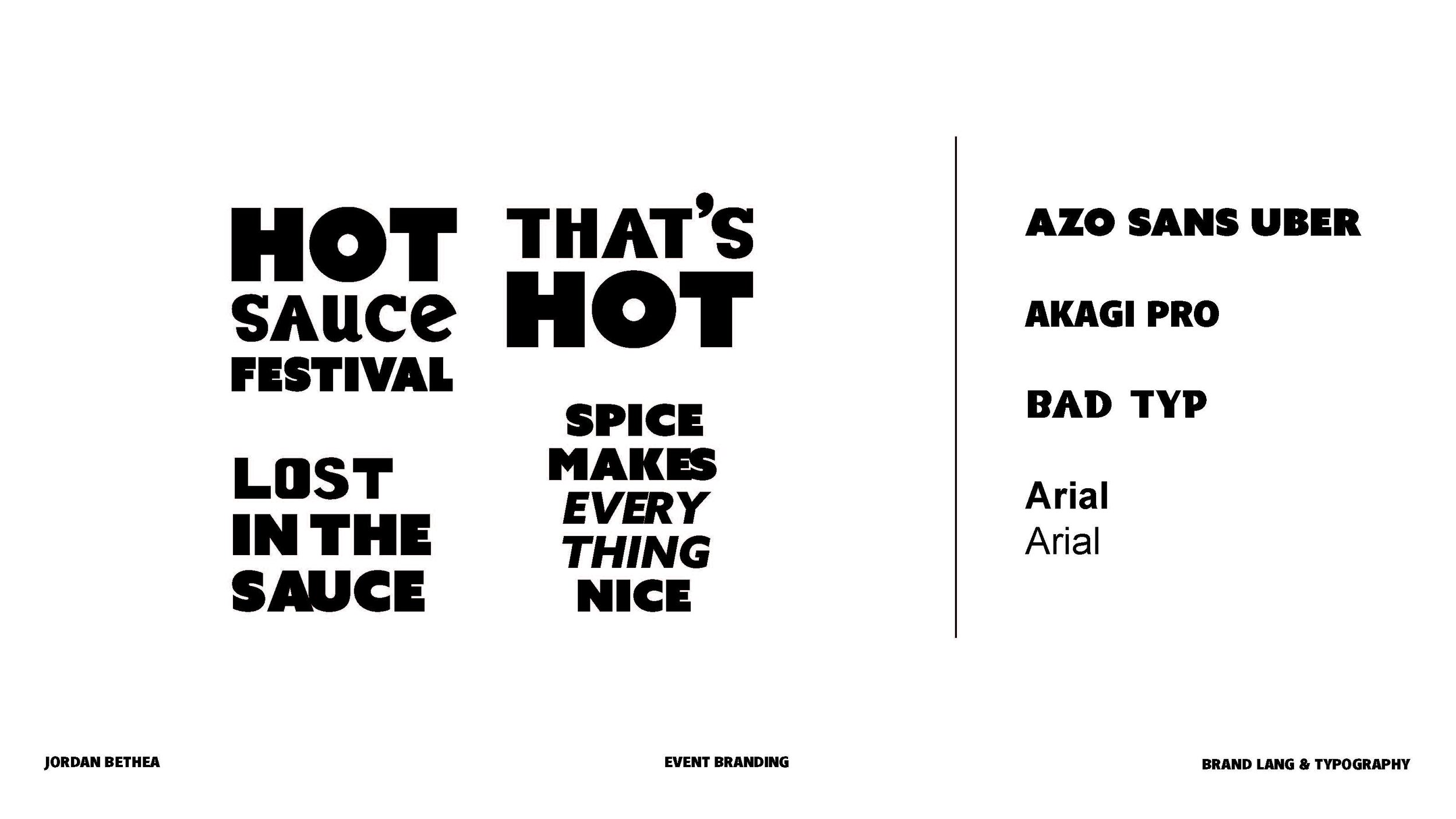


Jordan Bethea
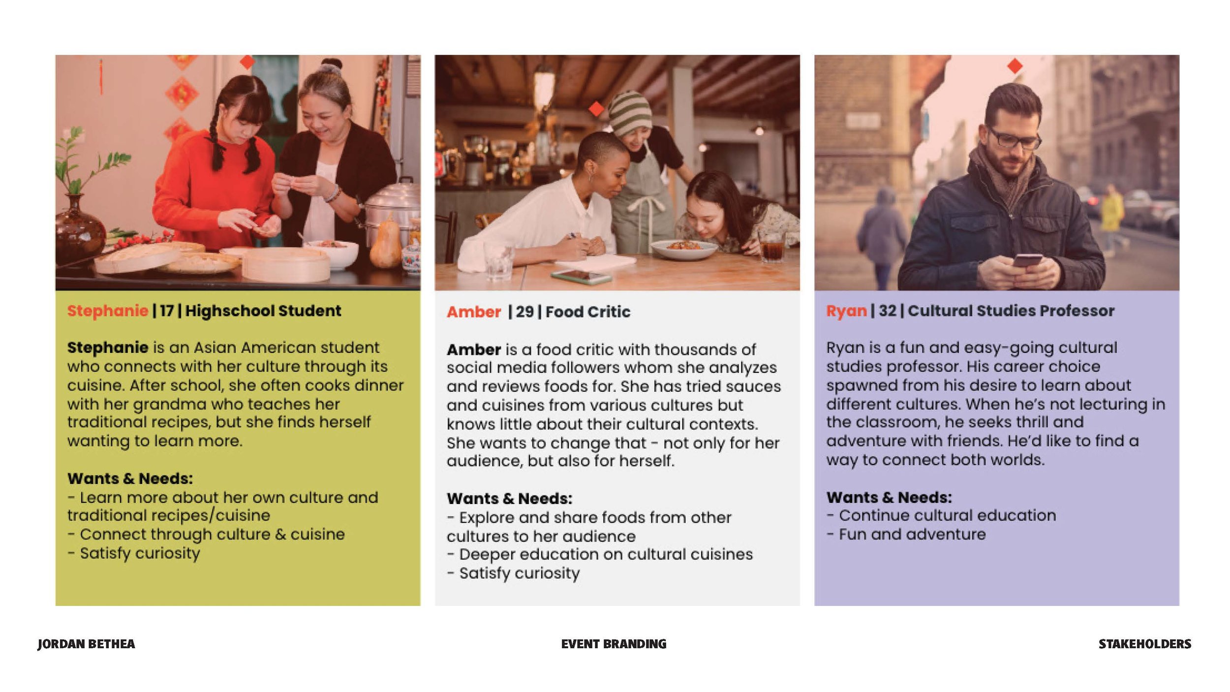
For this project, we had to conceptualize, brand, and design materials for a festival of our choice that supports a cause/mission. I created Inferno Kitchen, a hot sauce festival where you can try hot sauces from different cultures around the world. The mission involves supporting local and small businesses of color as well as giving them the opportunity/space/platform to celebrate and represent their culture through the shared love of hot sauce. My process involved research on different cultural hot sauces, sketching hand-drawn logos, moodboarding and more. I wanted a bold, fun and playful aesthetic that conveys the feeling of heat and spice. I communicate this through the peppery logo, to the comical brand language, bold typography, the festival assets, and a colorful palette that screams spice and tanginess.


Matthew Bayer
Mana Fest is a Magic: The Gathering themed festival. The festival, meant to support local artists because of the prominence of artwork around the Magic game, would feature art competitions, card artist meet and greets, and make your own custom card. Other deliverables were the lanyard passes, poster, and card box, and Magic guidebook.


MJ Carafa
The term “f8 and be there” is an expression popularly used by photographers to indicate the importance of taking the opportunity for a picture, rather than being too concerned about using the best technique. Our festival is a platform for both established and emerging photographers to display their creativity, passion, and unique perspectives through their photographs. F8 is proud to announce our partnership with Fresh Artists, a nonprofit organization that is dedicated to empowering young people and supporting arts education.


Maura Fallon
For this project, we were assigned to create and brand our own festival. I chose to do a nature photography festival called Wanderlust. I created multiple assets including a website, brochure, posters, digital ticket, merchandise and a keepsake folder that can hold other peoples photography.


Samantha Barkholz
We needed to create and brand a festival based off of a social cause. I decided to focus on cardiac awareness because it has played an important role in my life and my family. It is crucial to bring awareness, encourage activeness, and offer support which is what my festival strives to do. It is bright red and stands out to grab your attention, but it is still upbeat in energy and goal. Every choice I made connected back to the strength, support, and flowing aspects of the heart and cardiac awareness. Although it has several meanings, the most crucial meaning to my logo is it is a diagram of the blood flowing from the veins, through the valves (the openings), and to the eateries and aorta. I am very passionate about this topic, and I am proud of how my designs came out.


Nicole Mambuscay
Viva Fest aims to celebrate the rich and diverse culture of Latin America while also helping an issue that affects the country being featured. Our vision is to become the leading Latin American festival in the world, while also creating positive change in the communities we serve.


