D3 F22 LP

Allison Cravo
For the album project, I chose to create a design based on Djo's album called "Decide". The songs on the album sound very colorful and a little funky, but also very soothing. I immediately had the idea to manipulate my text using this liquifying technique. In the end, I love how it turned out and believe it represents the essence of the album well.

Andrew Sack
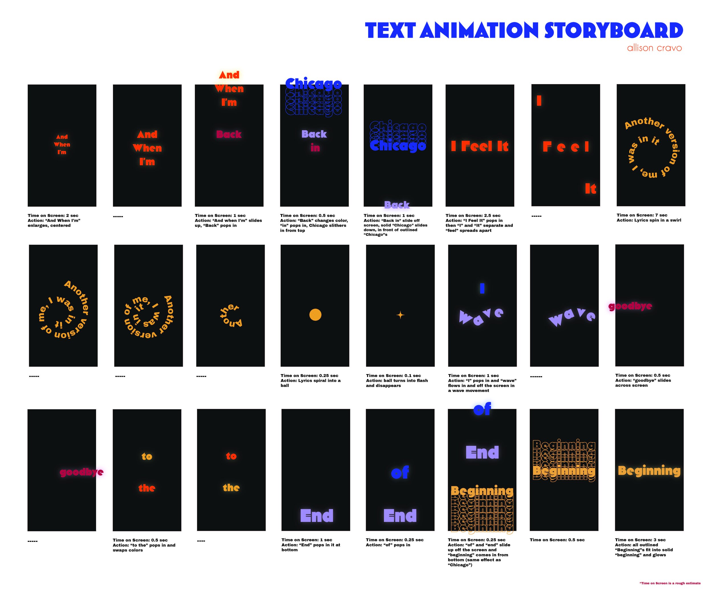
For this project we were assigned to re-design an album cover and LP of the album. The album I chose was 'Divine Feminine' by Mac Miller, who said that the concept for this album is his love for the universe. Based off that concept I tried to visualize love for the universe. The first three panels are the front, back and inside panel of the LP. The bottom panels is the inside of the LP including all of the lyrics to all of the songs on the album. As well as this, I designed labels for the record which include what songs are on what side of the record. I also designed a story board for an animation of the lyrics from a verse of a song off of the album.

Annika Zitto
This project tasked me with redesigning an LP package with typographic imagery. I redesigned I Robot by the Alan Parsons Project. The album has inspiration from Issac Assimov and a dystopian story that goes along with it. One song can be read both from the perspective of a robot or a human, and I used this as inspiration for a heavily perspective-based album cover. I also included grainy gradients to recall 70’s science fiction novel covers.

Emma Prushan
After being tasked with going to a record store and finding an album we are unfamiliar with, I redesigned the LP package for Three Dog Night’s Suitable for Framing. I used the conceptual and formal qualities of the music when creating my design, and as a result, played with composition and repetition to create the concept of framing and urgency. With my color palette, I sought to capture the 70’s era of Three Dog Night, while also playing with the high contrast of the album’s themes and the muted colors of memory. In my lyric animation, I was able to further work with the concept of memories and how stories may distort them by having the lyrics of the verse fade and overlap.


Hailey Riley
This project was a redesign of an album package and lyric animation. I ended up with the album Something Real by Phoebe Snow. While listening to the album it was very sad and soft with research I learned it was dedicated to her late mother. Phoebe shared her real emotions in the songs and I wanted to recreate that ih the album design. I embossed the title Something Real, mother Lili on the dedication page, and side one, and side two on the inside spreads. This way when you touch the album you are touching more than just paper you are now abe to feel the words. I used blue ink to relate to the sad aspect of the music. People relate the color blue to sadness and the drips relate to tears.


Haile Hughes

Haile Hughes

Hanna Zelcer
I chose the song "Take My Breath" by The Weeknd. The extended version of the song has a large buildup and is very reminiscent of a disco song. This is why I was inspired to make the letterforms out of the light refractions of a disco ball.

Hanna Zelcer
I chose the song "Take My Breath" by The Weeknd. The extended version of the song has a large buildup and is very reminiscent of a disco song. This is why I was inspired to make the letterforms out of the light refractions of a disco ball.

Hanna Zelcer
I chose the song "Take My Breath" by The Weeknd. The extended version of the song has a large buildup and is very reminiscent of a disco song. This is why I was inspired to make the letterforms out of the light refractions of a disco ball.

Joelle Klouda
Raw Sienna is a successful British Blues rock album recorded in 1970 by Savoy Brown. Its sound ranges from relaxing to psychedelic with its electrifying bass lines and big brass sound. Their lyrics explore topics of struggles in life, living while young, relaxing, addiction, and being on the edge of society. The exterior of the LP Package was made using the texture and colors from a piece of psychedelic fabric. The type was made using scans of letters cut out from a sheet of yellow plastic. The inside pattern was created from the same pattern from the fabric on the cover.

Lillian Dolhancryk
This is my album redesign for David Bowie's The Rise and Fall of Ziggy Stardust and The Spiders From Mars. The front and back cover were created using procreate and illustrator. The inside lyrics are meant to match the colors in the tie dye behind the webbing of the front and back cover. Because of how long the lyrics are, the album opens up to three panels instead of two, leaving room for the tie-dye color inside.

Maddy Podolnick
I decided to redesign the album Brand New Eyes by Paramore. Through the use of frames, I conveyed the message of seeing things through a set of "brand new eyes". In the background of my cover I decided to make a pattern out of the name of the album in a scratchy handwritten font. I wanted to contrast this by photographing frames and placing the band name inside these frames in more clean and easily read fonts. I think this contrast that I created shows the idea of seeing things differently and framing situations to open up to a new perspective.

Maddy Podlonick
I decided to redesign the album Brand New Eyes by Paramore. Through the use of frames, I conveyed the message of seeing things through a set of "brand new eyes". In the background of my cover I decided to make a pattern out of the name of the album in a scratchy handwritten font. I wanted to contrast this by photographing frames and placing the band name inside these frames in more clean and easily read fonts. I think this contrast that I created shows the idea of seeing things differently and framing situations to open up to a new perspective.

Nia Robinson

Nia Robinson

Nico Sawester
Design an LP package for a vinyl record, including all album credits and lyrics, and create a physical mockup of the final LP package design.

Nico Sawester
Design an LP package for a vinyl record, including all album credits and lyrics, and create a physical mockup of the final LP package design.

Nico Sawester
Design an LP package for a vinyl record, including all album credits and lyrics, and create a physical mockup of the final LP package design.

Nico Sawester
Design an LP package for a vinyl record, including all album credits and lyrics, and create a physical mockup of the final LP package design.

Nico Sawester
Design an LP package for a vinyl record, including all album credits and lyrics, and create a physical mockup of the final LP package design.


Riley Gallagher
For my album project, I decided to redesign Red (Taylor's Version) by Taylor Swift. For the title, I wrote RED in red lipstick and filled the letters with red kiss marks, because one of the things that Taylor Swift is known for is always wearing bright red lipstick. For my lyric animation storyboard, I used the title track from the album.

Sophia Boxwell

Sophia Boxwell

Sofia Testa

Austin Bortz
For this project we were tasked with redesigning a album cover with type. I decided to redesign the Foo Fighters album, The Colour and the Shape. This album has a feeling of nostalgia to its music so I decided to create the title using 90's styled patterns typically used in bowling allies and arcades.

Nomeda Nazarenkaite
In project 4, I did a LP Package for a band called Jefferson Starship and their album named Winds of Change. I think the thing that helped me figure out the theme and design was moodboard and mindmap. I explored carefully the emotions that I felt when I listened to this and the Winds of change album truly represented the mood of being in a rollerskating rink. That’s how I came up with the idea to photograph and play with Disco balls and try to “catch” the feeling of movement and entertainment as well as happiness. The design came together when I decided to use a specific dark, brownish color for the background, putting the disco lights on top. Another new thing was printing on a shiny mylar project that was the most exciting part for me personally. Now I have some experience with UV printers and how they work as well.


Emily Penrose
LP Design for Prince's 1984 album, Purple Rain.


