
JUNIOR SHOWCASE
Rebrand Logo System
In this project, students designed a series of identity marks intended as a rebrand of a local Philadelphia organization.


Aidan Roe
For this project, we were tasked with creating a new logo system for a local company. My local company was The Book Trader, a used book store in Old City. During this project, our focus was to iterate and gradually refine the brand marks we designed.


Autumn Small
This purpose of this project was to redesign an already existing local Philadelphia business. I chose Dreams Ice Cream which is an ice cream shop located in Glenside, PA. When I saw the brand’s logo I felt like they were focusing a little too much on the “dreams” aspect of the name and it wasn’t very clear that it was an ice cream shop. In my redesign I decided to create an ice cream scoop that can also double as a cloud and a waffle cone so that both aspects of the name are being seen. I also wanted the brand to be fun so I created some characters and patterns to go along with my logo.

Daymond Chan-Green
The purpose of this problem was to redesign a brand for an already existing company here in Philadelphia and the company that I decided to rebrand a logo for was Wise Guy Tech Solutions. The conclusion I came too with this rebrand was a logo that classified as a mixture between abstract and pictorial with the letter "W" in Wise represent an outlet since Wise Guy Tech Solutions is a tech shop.


Daniel Gentner
Black Cat Tavern Rebrand

Emma Maddaluna
Ode a la Rose is a fast paced flower delivery service that brings the touch of Paris to everything they do. The new logo is a simplistic line drawing that connects to a rose in the middle. The delicate lines give a taste of the French elegance Ode a la Rose prides themselves on. The colors give a modern touch with the addition of the deep purple that signifies royalty and the brighter pinks/magenta.


Erika Sheehan
Vault and Vine is a local retail plant shop and cafe located in East Falls, PA specializing in creating a cozy space to enjoy nature’s beauty and relax with a cup of coffee. I was tasked with rebranding their current logo, using five logo techniques which include: wordmarks, letterforms, emblems, abstract, and pictorial. I sketched logos within each of these categories and landed on an abstract letterform to better represent the company. My logo and color palette create the cozy, natural feeling that this coffee shop embodies.


Ashley Anousaya
For this project we were tasked with redesigning the logo of a local brand or business. I chose to focus on Forrest Theatre as my redesign. Forrest Theatre is a local theater founded in 1927, located on Walnut Street in Philadelphia specializing in live theatre and art. What sets them apart from others is their rich history and beautifully delicate interiors and amenities. I created a new logo system based on the idea of the magical life the stage can ignite.


Alex Pessolano
For this project we were tasked with choosing a local business from a list and doing a rebrand of their logo. We had to research their company to figure out how to create their new logo. My business was Flying Monkey Bakery in Reading Terminal Market.

Matthew Bayer
Logo Redesign - Black Cat Tavern. For the project, I had to choose an existing Philadelphia based business and redesign the logo for them. It required exploring ideas for all five types of logos - wordmark, letter mark, emblem, abstract, and pictorial. My final solution was a mix of pictorial and wordmark.

Samantha Barkholz
In Project 1 we were tasked with redesigning the logo of an existing company in Philadelphia. I chose to do Cry Baby Pasta. After lots of brainstorming and iterations I finally decided on a logo made from shapes resembling noodle. A bow tie pasta on the head, macaroni for the eyes, and teardrop shaped noodles for the tears. It was a fun concept that brought life back into the logo and wasn't trying so hard to be cool. I'm really happy with my final design.

Sienna Viera
This project focuses on the process and methods of creating a clear brand mark of an existing company. From a broad exploration of the five different mark classifications to gradual refinement, I narrowed down a look that I thought best went with Ode A La Rose's classic flower service. My final brand mark is a letterform with the mix of a pictorial mark within it. I wanted to create something that embodies the delicate essence of a flower, with both the graceful edited font and floral pictorial mark, to have viewers be able to instantly recognize what Ode A La Rose is all about.


Jordan Bethea
For this project, the problem we were solving was figuring out how to rebrand a local organization selected from a list, and making a successful branding system. Mine was the Frosted Fox Cake Shop. I immediately had ideas of using the fluffy tail of a fox to represent frosting, curly script fonts, and a soft color palette. I wanted a pictorial logo that embodies elegance but is playful and cute at the same time. I believe my branding system and logo were a successful design solution in rebranding the organization in that they really capture the brand’s name, history, and overall identity.


Kayla Brown
For my Logo Rebrand of Barkadelphia, a doggie daycare in South Philly, I wanted to create a new logo system that shows a dog’s personality through its design. I chose a paw print, a bone, and a dog nose and mouth to replace the vowels in the system. This shows that it is a center for dogs at the forefront. To emphasize that more, I made the logo a color that a dog would have rather than a bright color that does not correlate to the brand. Using an all caps San serif shows the loudness and playfulness that dogs have. The qualities of the rebrand help Barkadelphia shine through as being the place for man’s best friend.


MJ Carafa
Forrest Theatre has been located in Philly for decades, which means their branding identity could use a little upgrade. I designed the new branding identity based on what the theatre attempts to do: bringing the story to life on stage. While also paying tribute to Edwin Forrest’s everlasting performances and inspiration towards theatre.


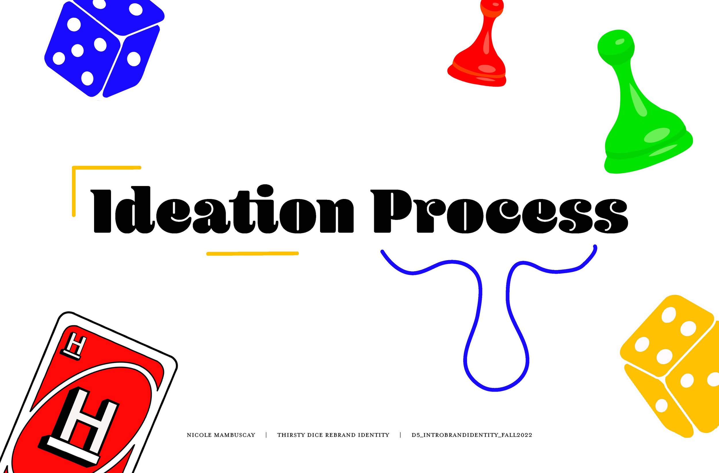


Nicole Mambuscay
The purpose of this project was to redesign a local organization in Philadelphia. My rebrand was intended for Thirsty Dice, I based my design decisions on the trope of a board game cafe as well as the feeling of the business atmosphere.
Culinary Experience
The way Americans consume food has been evolving. Societal changes, technologic innovations, and environmental concerns are changing the landscape of food consumption. Climate change has made people question their dependence on meat and poultry. The pandemic has opened avenues for innovation in the way commercial kitchens craft and deliver food for patrons, while also reminding us that the experience of great service in a well-designed space can’t be topped by simply staying at home. New culinary experiences are challenging how we think about food consumption, and strong brands are leading the charge. For this project, students are assigned a food service category at random, as well as a genre to give your culinary experience a point of view.


Ashley Anousaya
For this project we were tasked with creating a brand system for a given food service type and genre. This included any type of menu system and other physical or digital components. Meet Cute is an on-demand experiential food service specializing in a two-option menu based on romantic comedies. What sets them apart from others is their curated comfort factor for the shes, gays, & theys. With this in mind I created a logo system that reflects the ideals of passion and love contrasted with the ideals of heartbreak and betrayal for the perfect night-in cuisine. Shown is the delivery box the food would come in along with a food container, a container, and a tissue box to get you through that tough breakup.


Alex Pessolano
For this project we were tasked with creating the brand identity for a restaurant. The restaurant was based on a movie genre and a style of restaurant. We had to make the logo, any physical items, and a web element.


Aidan Roe
For this project, we were given a food service category and a genre from which to create a culinary experience brand. I was given on-demand food service and the superhero genre. The brand I created is SUPHERB, an on-demand food experience that serves beneficial food to health-conscious millennials and gen-zers. The packaging and digital aspects of the brand were the most important because of not having a physical space due to it being an on-demand food service.


Autumn Small
This purpose of this project was to create a culinary experience/food consumption brand. I chose to do a superhero themed dessert bar that I called “Super Sweets”. Our deliverables were to develop a name, positioning statement, logo system, menu design, and for my last two components I created packaging. I decided that my brand was going to really focus on being very fun, colorful, and playful. My thoughts when designing were that I wanted to bring out the inner child in everyone no matter how young or old you are and that is reflected in my design decisions.


Daniel Gentner
Pommes Freaks! Culinary Experience


Emma Maddaluna
We were given the task to create and brand a type of restaurant mixed with a genre. My two categories were formal dining and parody, an ironic mix. Maison et Fous, Mad House, was crated as a formal restaurant that prides themselves on good food and a unique experience that welcomes the curious and a little crazy into their dishes. For the project I wanted to mix the elegance of French words and childlike dishes as well as psychedelic patterns. I took inspiration from Alice in Wonderland with the patterns and some saying such as : “We’re all mad here”. The menu ties that together with the addition of a wood panel for it to sit on. And of course, Maison et Fous starts with dessert.


Erika Sheehan
Ritzy is a classic, formal dining restaurant focusing on the glitz and glamor of the Roaring 20’s and Old Hollywood. The task was to create a company based on two categories, restaurant type and genre. I was assigned a formal dining restaurant with the genre classic. With this in mind I decided to create Ritzy, an elegant restaurant featuring artistic entrees with wine to match the special occasion. I created a logo system, color palette, and brand assets that feel elegant and inspired by the 1920’s Art Deco style. Our wine system features expensive wines, which is a fine dining staple. This wine will come served with a branded wine glass and elegant foods to match.


Jordan Bethea
This project involved choosing a food service category and genre(s) from a list provided, and crafting a brand identity solution to it. Doing so, I developed the brand BayBae, a rom-com themed pop-up by the bay. The rom side of it involves BayBae’s speed-dating feature, and the com side of it involves the brand’s witty name (a clever play on words), brand voice, and ice-breakers. I wanted a wordmark logo that gave a fresh and fun beachy vibe. I utilized colors that represent love, romance and the beach, and a fun, playful pattern. I believe my branding system and logo were overall a successful design solution in creating an original brand. BayBae brings the lovey-dovey, hilarious, wacky romcom world to you.


Kayla Brown
For my Food Consumption Project, I created a Broadway musical themed food truck called Broadway Bites with a brand system for both fans of Broadway and those not too familiar. The design is a bright yellow star with a bite in it to indicate that it is an eatery. The script type, Voltage, is a modern take on the traditional New York theater scene. With brand assets that bring the food to life, copy that pays homage to classic musicals and bright packaging, Broadway Bites remains in the spotlight as a direct communicator of its brand identity.


MJ Carafa
Develop a new culinary experiences, that challenges and shifts our perspective of how we think about food consumption. Quixotic is a futuristic food truck that puts an emphasis on night life and night life culture. Allowing go-getters to have a futuristic out of this world experience right outside the party. Serving other worldly snack and exotic beverages from across dimensions.


Nicole Mambuscay
The purpose of this project was to develop a culinary brand based on a specific food service. The brand must create a culinary experience based on the audience, brand essence, competition, objective, and overall strategy. The food service assigned to me was the creation of a food truck brand. With that being said I decided to create a culinary experience that intersected the trope of cartoons with cannabis-infused munchies.


Samantha Barkholz
For Project 2 we were randomly generated a type of food service and genre. We then had to build an entire brand and company from only those two things. I was given fast casual and romantic. I liked the idea of a speedy restaurant which in turn made me think of speed dating and the initial moment you like someone and try to use your cheesy pick up lines. That initial...crush...you have. So my fast casual build your own pasta restaurant named Crush came to be. I even incorporated elements of my first crush into the brand. The pasta bowl packaging is a letter I typeset. That letter is a love letter I wrote to my first crush in middle school. Thank you Wesley.

Daymond Chan-Green
The purpose of this project was to develop a brand identity system for a culinary genre of our own. I decided to make a brand for an anime themed sushi bar with my main logo being an animated sushi character that has aspects of some anime artwork. I then used that logo to develop a brand system that would work on business cards, food menu, chopstick sleeves, and takeout boxes.

Matthew Bayer
For the food consumption project, I had to design a brand based around the parameters of a café with the theme of sci-fi/futuristic. I had to come up with a name, logo, and other brand elements such as packaging and menu. I named my cafe the Black Hole Bistro, and used a number of developed assets across all the designs, such as the stars and black hole illustration.

Maura Fallon
For this project we were randomly assigned a food service category. My food service category was a mystery formal sit down. I named my restaurant Mystery on Main Street. It is a mystery themed formal restaurant where you can solve your own mysteries while you dine.

Sienna Viera
The objective for this project was to craft a full identity system for a food service category. I created Buckaroos, a western style food truck that brings you into the world of the wild wild west through its food and engaging atmosphere. I wanted to bring the classic style of western elements into this system by creating a background scheme to the menu that everyone can recognize. I used a brand voice that correlated with the idea of old western films, and made a logo that is based on a word mark but includes an illustrative element to resonate with the name and the customer. The type throughout the pieces matches the western theme, as it's type based on block woodtype which relates to wanted posters and western style type in general.
Forced Connection
“External factors — from economic to cultural, environmental and political — are affecting people more than ever before, making life more complicated and purchasing decisions more multi-faceted,” said Baiju Shah, chief strategy officer, Accenture Song. “There is a growing divide between what consumers need and value and what businesses offer, creating a relevance gap. We believe that companies can bridge this gap and herald significant growth by not focusing on promoting consumption, but in meaningfully contributing to customers’ lives.”
Students were assigned to concept and design an identity, with multiple brand touchpoints, for a wellness, music, or toy industry of your choice. Working in groups, students researched the current market, defined their company, researched and defined an audience, wrote a mission statement, named the company, and collected visual inspiration. Once the company has been conceptualized and defined, students individually developed a full identity system.


Ashley Anousaya
For this project we were tasked with creating a brand system for promoting consumption targeted towards certain consumers in regards to wellness, music, or the toy industry. Our group decided to focus on the wellness aspect. Bzzy Bites is a subscription service specializing in providing nutritious meal ideas to children 4-12. What sets them apart from others is their meal cards for the month centering on providing the necessary vitamins kids need to grow strong and healthy along with the information on the vitamins they are eating. With this in mind we created a new logo system based on the idea of being visually appealing to kids while informing and targeting parents who want to provide their kids a healthy balance in their diet. Shown is the subscription box along with the recipe cards, coloring cards, and a box of crayons.


Alex Pessolano
For this project we were tasked with creating a brand that solves an issue in one of three categories (toys, wellness, or music). We had to create the logo, a web element/app, and 2 student choice components.


Aidan Roe
Our assignment for this project was to create a new brand in a given category. We started in groups to research our topic and to define our company. Our topic was wellness. One of the most prominent problems we saw during our research is that roughly 1 in 5 women face sexual harassment in the gym and that gender minorities aren't typically able to find a gym that they feel welcome in. This is how we came to creating MYX, a fitness club with an emphasis on providing a safe and comfortable space for women and gender minorities.


Autumn Small
This purpose of this project was to develop and design an identity for a new brand in the wellness, music, or toy industry. I chose to go with wellness, specifically women’s wellness and developed a brand named “Missy.” Missy. is a subscription based vitamin/supplement brand that is geared towards educating young women on the importance of taking care of your health. I designed the identity for Missy. with a classic and simplistic feel in mind, I also wanted the color palette to be very feminine and soft.

Matthew Bayer
For the forced connection project, our group came up with a product and service that would be used by deaf and hard of hearing people to listen to music. To represent the spectrum of hearing loss and hard of hearing, I used a lot of gradients and colors in my design. Color and visuals were also important to the design because sight is important for those who have a hard time hearing.


Blake Turner
In this New Brand Development project I was tasked with creating a brand from scratch focused on an issue in the music industry. From this objective, Tutti was born. "Tutti," an Italian word meaning "everyone," in music notation, captures the core values of the brand. Tutti makes affordable, accessable, analog digital instruments that inspire to create. The visual style takes inspiration from 1980's editorial advertisements and electronic circuitry, giving the brand a classic yet modern feel.

Daymond Chan-Green
The purpose of this project was to develop a new brand out of the choices of the brand being either for music, toy industry, wellness, or a combination of them. For my project I decided to design a brand for a music/wellness identity and the brand I came to is called VIBE. VIBE is a brand that is offering both a service and product to enrich the music experience for people who are deaf or have a form of hearing impairment.

Maura Fallon
For this project we were assigned to build a brand based on wellness, music or a toy industry. My group chose to do a wellness brand. From there we each made our own company. I named my company Goddess. Goddess is subscription based app that provides vitamins and supplements that are catered to each woman’s wants and needs by providing information that is easy to understand.


Daniel Gentner
MYX Fitness was developed and is dedicated to giving women, the LGBTQ+ community, gender minorities, and anyone who may feel more comfortable here at MYX, a safe space to work out. MYX provides everyone with a clean, professional, but still laid back and welcoming gym environment at a low price point, to make fitness accessible to as many people as possible. Branding elements such as a stationary package, website, and social media ads have been created for this brand.


Emma Maddaluna
Myx is a fitness club dedicated to serving women and gender minorities. In most gyms there are tells of harassment and female guest being uncomfortable. For this brand development, we wanted to bring awareness and make a safe and welcoming gym atmosphere. Part of the development included lots of illustrations that added to the androgynous theme for those that are apart of gender minorities. Gyms should have a confident and friendly environment to their system and at Myx those who workout are presented with lighthearted illustrations and a community to help them.


Erika Sheehan
Viva Veggies is a biweekly subscription service specializing in providing nutritious meal ideas to parents with children ages 3-7. We created this brand with the focus being on health and wellness and catering to children specifically. What sets Viva Veggies apart from others is their meal cards for the month centering on providing the necessary vitamins kids need to grow strong and healthy. Viva Veggies brand identity is aiming to appeal visually to kids, while informing and targeting parents who want to provide their kids a healthy, balanced diet. Viva Veggies prides itself in delivering healthy, quick, and easy meal recipes, for busy parents or guardians.


Jordan Bethea
Project 3: New Brand Development: Forced Connection (Vibe)
This project concerned bridging the gap between what customers want and what businesses offer. We were to develop a brand completely from scratch that addresses real values and needs of customers in a meaningful way. The brand I developed is Vibe, a product, service, and campaign that enriches the music experience for the deaf community and the hearing impaired. I knew I wanted the logo to resemble the grooves of the ear, and the fluidity and movement of music. I wanted to use a gradient spectrum of colors to represent the spectrum of deafness and typography that felt modern, funky, and fun. I believe my brand design solved the problem of this project, as it brings attention and a meaningful experience to an underrepresented community.


Kayla Brown
Num Num is a snack subscription company for kids ages 4 and under. The goal of Num Num is to inform kids of fruits and vegetables and provide them with healthy snacks from what the parents choose for their kids. The color palette is inspired by colors of fruit and veggies and shown throughout the brand assets. The characters make fruits and veggies more fun, encouraging students to eat them in their snacks. With stationary and a game component for kids, Num Num is a service that parents and their kids will love.


MJ Carafa
Music can be expensive and never fully approachable, music should be expressive and effortless. Tutti aims to provide an easy and accessible avenue for young people to experience the joy of music creation and production. We do this by offering a unique set of products and services, starting with user friendly instruments that require no music knowledge whatsoever.


Nicole Mambuscay
The purpose of this project was to create a full brand identity system for a wellness, music, or toy industry of our choice. As a group, we decided to choose the wellness industry for children. More specifically, the nutrition of a child. From there we developed a subscription box meant to aid parents in feeding their children nutritious meals. I decided to create AlphaBites, a meal subscription box. AlphaBites encourages children to unleash their creativity by drawing on our sustainable packaging.


Samantha Barkholz
In Project 3 we were given an assigned industry and tasked to create a company that would solve an ethical/sustainable/environmental problem. I was given the toy industry and I focused on plastic waste in toys. I took the company Bibble and focused on baby toys like teething toys and how they could be made of sustainable hemp material.


Sienna Viera
The problem was to concept and design an identity, with multiple brand touchpoints, for a wellness, music, or toy industry of my choice. I decided to create a women's vitamin/supplement subscription site that includes a range of resources for women to have access to more information to benefit their health overall. To develop a full identity system, I began by identifying what I wanted my brand to represent and how I wanted consumers to engage with the site. At PURE, we want to encourage women to be at their healthiest. We help design a package of supplements that is perfect for each woman and their body's needs. We want to inform women through our site and brand to learn more about what you should they taking and how knowledge can help them feel their best! To create these packages, we use a quiz available on our website to narrow down what you will receive in your box. Our brand is very inviting, using bright colors and a comforting, supportive brand voice to welcome women to our environment. PURE is targeting a younger age range, therefore, the logo is mainly illustrative and straightforward as a colorful vitamin and the site is easy to interact with by reassuring you throughout your experience with it.


