D4 S22 Collection

Alex Pessolano
Our problem was to create a catalogue of a collection we own. This collection could be anything that could classify as a collection. So I chose the various plants that I owned and I decided to make a care guide for those plants. I wanted to keep my book very airy and neat and calming in a way to sort of relate to the plants.

Aidan Roe
I was tasked with designing a collection catalog for an exhibit on a collection I have. For the collection catalog, I decided to cover my coin collection. However, it was not feasible to encompass the hundreds of coins I have, so I chose to limit it to foreign currency. Upon further research into my collection, I realized a decent number of my coins were minted in significant years for the country, so I wanted to home in on that aspect. I chose to use type to depict what was happening in each country. It also serves as a contrast between stereotypical coin books and what really happens in foreign countries.

Blake Turner
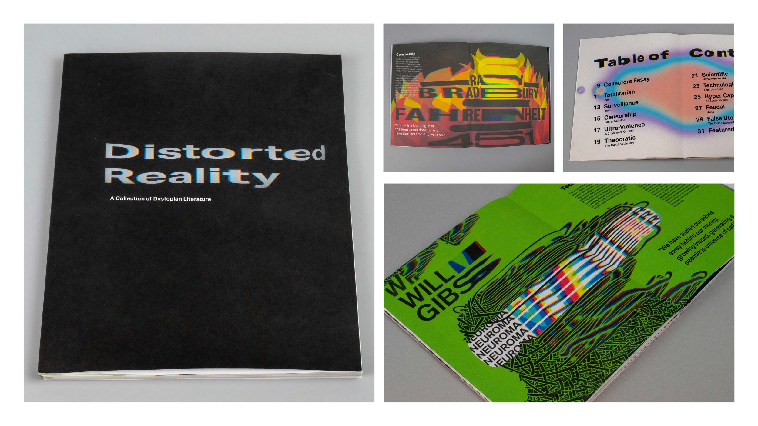
For this project the goal was to curate a collection of items that all have a common theme that could be displayed visually. I chose to explore my collection of dystopian literature, and find the common thread between them. I found that like most pieces of fiction, these books showcase a "distorted reality" – a reality like our own, with subtle, or not so subtle, distortions that make their world different from our own. I took this concept and ran with it, physically distorting the book covers to make the imagery for my catalogue. From this project I learned how important the physical aspect of creation is as it lets you explore many things that you could not otherwise do digitally.

Daymond Chan
The purpose of this project was to design and build an exhibition catalog to be showcased at the Design Center at Thomas Jefferson University. The collection was selected of my own choosing and it had to be either something I possessed or a new type of collection that I could have begun for this project. For this project I did mind maps on how I wanted my catalog to look based on my collection which was anime graphic t-shirts. Since I was working with anime related content I wanted my book to be made in the format of how manga are manufactured in Japan which is the style of reading right to left. So I had to practice and work on making my text legible from right to left and being coherent with my photography of t-shirts. There was also practice comps I did of putting my book together in the style of manga, opening from right to left, so that I can see if the book was working together as a whole.

Daniel Gentner
Untapped: The History of Craft Brewing is a catalog of my personal bottle cap collection. The catalog covers the most significant parts of my collection, including big names and smaller independent ones. Key learning points included setting large amounts of text and establishing textual hierarchy. My process included creating various type iterations to determine typefaces used and hand-binding the spreads to create the book.

Erika Sheehan
The objective for this project is to create a catalog using a personal collection of your choosing. I chose my Disney World pin collection for this project. I photographed each pin in different ways to incorporate on my cover and throughout the project. The goal is to be able to handle a large amount of type, alongside images and additional assets to the piece. I enjoyed being creative with this project and being able to incorporate my hand drawings into my digital work. I learned how to handle bulk text and was able to incorporate my own writing into the piece. This project taught me the structure of a book and the important details needed to keep information hierarchically correct for viewers.

Matt Bayer
I had to photograph one of my collections (I used my autograph collection) and design a book featuring them for my advanced typography class. The book includes two short essays along with spreads that display the collection. Throughout the book, I embraced the autographs as a unique form of typography and used them all throughout the design of the book.

MJ Carafa
I had to photograph one of my collections (I used my autograph collection) and design a book featuring them for my advanced typography class. The book includes two short essays along with spreads that display the collection. Throughout the book, I embraced the autographs as a unique form of typography and used them all throughout the design of the book.

Nicole Mambuscay
This project focuses on the creation of a catalog based on a chosen collection. For my project I decided to focus on my collection of healing crystals. More specifically, the history of healing crystals and their properties and uses. The intended purpose of this project was to create a catalog which focused on hierarchy, use of typography, use of imagery, and overall composition. The typography utilized was chosen based on the feeling in which crystals evoke, a sense of spirituality and lightness. Throughout the spreads, there is a consistency of mirrored images to present the crystals as well as a consistency in the design elements utilized.

Samantha Barkholz
The Collection Catalog objective was to design an Exhibition Catalog to accompany a (fictional) exhibition held at the Design Center at Thomas Jefferson University. The collection on display at this exhibition was of our own concept and curation. After much brainstorming, I ended up basing my collection around my fun socks. After choosing socks to display in my catalog I discovered that I was able to attach memorable stories and moments in my life to the socks. So the socks I moved on a clothesline through my catalog ended up showcasing happy moments on the timeline of my life. I went through many stages of photography and arranged my spreads to end up where they are now. I also went through the trial and error process of designing a hanger to hang my book on like the socks you buy at a store. I had the idea, and after cutting several kinds of plastic with several different tools, I was able to create a hanger/bookmark for my catalog.

Sienna Viera
For this project students I created a place for my Uncle’s sneaker collection. I enhanced the beauty of the shoes by giving them a place in a cultural context, the history of the sneaker-head culture. Working predominantly typographically, additional emphasis was also put on giving the collection visual form. I began with the research, and going off of that information came by urban based theme for the catalog. I created visual type aspects including title pieces in the form of graffiti and “melting” the letters to create endpapers to all reference street art. I made a collage aspect to give the history along with the typographical aspect of the essay itself.

Ashley Anousaya
The task of this project was to create a collection catalogue surrounding an item or topic that we collect or have a lot of. For this project I decided to create a catalogue about the squishmallows I collect. I began with a research map by listing all the squishmallows I had and their stories and names. I then researched a bit about the trend of squishmallows and what they were while creating a moodboard of what feeling I wanted the catalogue to convey. I decided to aim for a fun, childlike aesthetic incorporating scrapbook and sticker book effects. I also used a fun color scheme and bubbly typeface Cooper to display a childish feeling similar to the plush toys.

Kayla Brown
The objective of the Collection Catalog project was to design a catalog for a collection exhibition that would be at the Design Center at Jefferson University. My catalog is about souvenirs I have collected during my travels. I designed my catalog using Photoshop, Illustrator, and InDesign. I learned the role of typography in print and the language to identify pages in a book. Through iterations, I accomplished creating a catalog that embraces white space and manages hierarchy through type.
I decided to choose my souvenirs due to its variety and storytelling advantage. In deciding, I considered a collection of bells, teapots, and girl scout patches. I originally created a moodboard, gathering inspiration of what I wanted my catalog to be, wanting a scrapbook feel. Soon after, I jumped into the pages of my catalog, placing the text and imagery first. Seeing the words on the page digitally, I attempted to shift the spacing to fill the entire page. What I learned, however, was that everything did not have to fill the page completely. Throughout my catalog, I began to embrace white space. My favorite part was silhouetting the souvenirs and having the text embrace their shapes rather than mask it.

Jordan Bethea
“Representation Matters” Collection Catalog
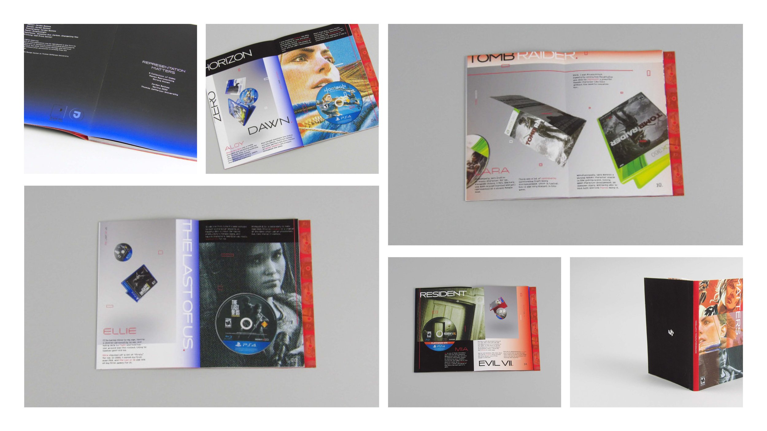
This project involved making a catalog about something we collect. My collection focused on video games I've collected over the years. I did not include my entire collection, rather, I only included or focused on the ones that had a common theme; that featured strong women. Thus, the narrative of my collection surrounded a natural pattern I saw within my own collection which were strong women, what makes a strong character, and why the representation of women in media, specifically video games, matters.
My process began with deciding my collection. I had many other ideas, with the runner-up being movie tickets I had collected since 2014, but they were not visually compelling enough to work with. I ended up with video games, and began figuring out what story I wanted to tell. Simultaneously, I made a mood board and research map to explore aesthetics and content strategy. I sketched storyboards of each spread to figure out the layout and pacing of the book. Lastly, I brought the spreads from low-fidelity to high-fidelity frames


