

Experimental Typography
Display Fonts
For this project, students created an original display typeface based on a chosen theme. Through historic research, experimentation with technique, and iteration, students created 26 capital letters, a specimen sheet, and designs showcasing the typeface and letterforms.


Maddy Podolnick
Bubble Dreams is a font designed to transport you to the enchanting world of fairy tales with its delightful combination of soft, dreamy shapes and sweet bow illustrations. Each letter is crafted with soft, rounded edges reminiscent of playful bubbles floating through a magical kingdom. This font exudes a sense of girlish charm and innocence, inviting you to embark on a whimsical adventure. Use our initial caps variant adorned with charming bow illustrations for all your fairytale needs.


Daniel Gentner
For our custom typeface project, I created a custom futuristic display typeface inspired by the chrome logos found on automobiles and other technologies from the 50’s, 60’s, and 70’s.


Emma Prushan
Solarium is a display typeface inspired by celestial bodies and the relationship between light and shadow. I was initially drawn to sundials as a source of inspiration, and as a result, created a radial grid that I laid over my letterforms, removing a piece of the letterform based on greatest legibility. I then added round flourishes in order to reference the form of the sun and moon, as well as a star shape where the letterform is removed to increase legibility. Solarium comes in four variations with varying levels of flourishes in order to allow letterforms to better sit next to one another, as well as give designers more freedom over use of the typeface.


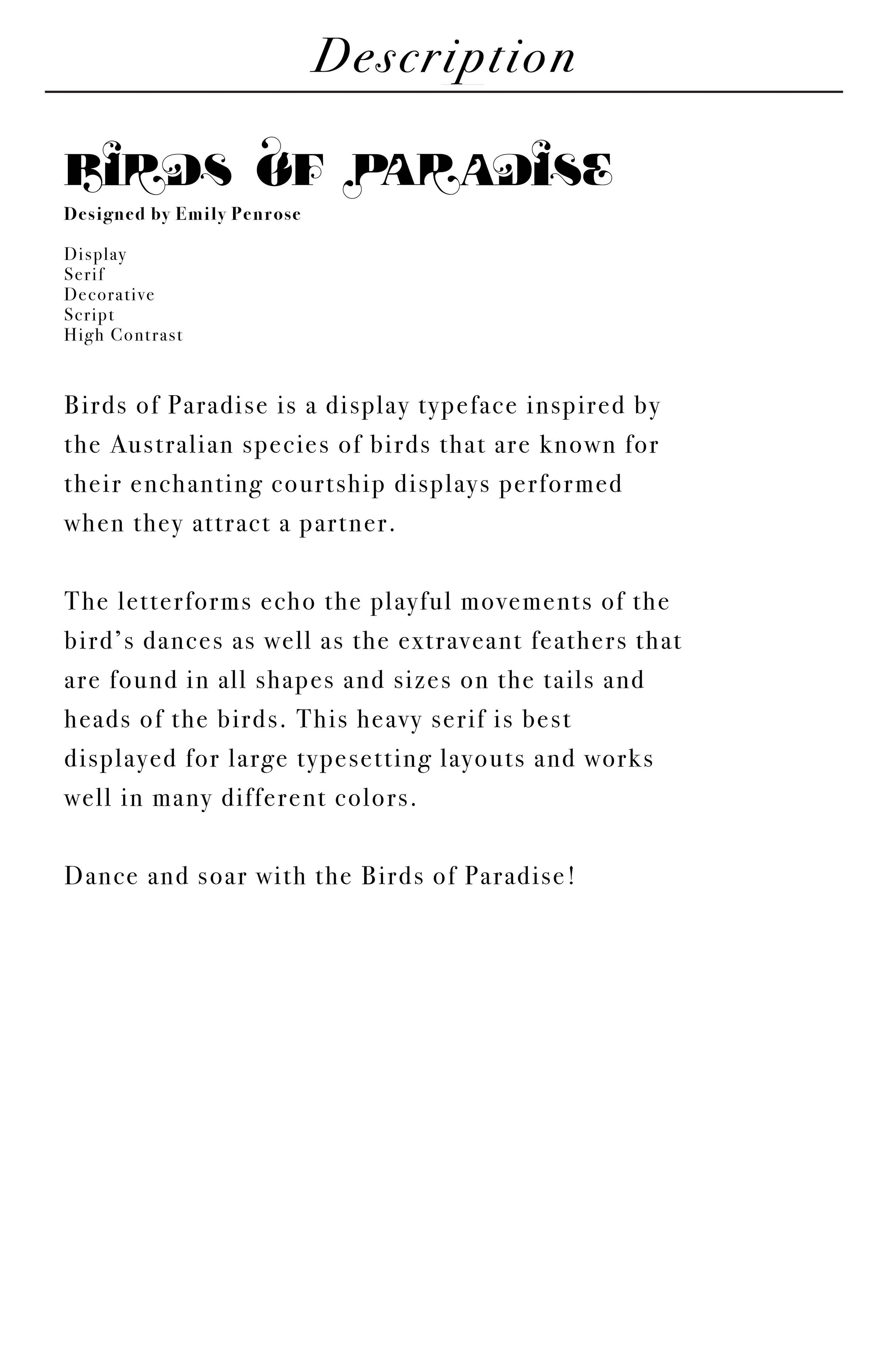

Emily Penrose
The Birds of Paradise typeface, inspired by a real yet fantastical species of Australian birds. The serifs reflect the beautiful feathers and the movement plays off of the birds' ballerina dance, or courtship ritual that is displayed to find another love bird.


Riley Gallagher
Little Guys is a playful display typeface, made up of letters that are each their own character. Each letter has eyes, and they all wear an article of clothing; a sweater, socks, or shoes. Little Guys includes a mix of rounded and geometric letters, making it even more fun to mix and match the different letterforms. This typeface could be used to design children's toy packaging, book covers, or any other fun, playful brand or design.


Alex Pessolano
For this project, we were tasked with creating our own typeface based on anything we wanted. My idea ended up being an isometric typeface that can be used as a typeface or as a unique way to create patterns. The name of this typeface is IsoType, and it is a San-Serif, Isometric, Display font.


Aidan Roe
GoogieType is a typeface inspired by Googie architecture and iconic signage and typography that was often paired with it. Rooted in the mid-20th century, Googie architecture emerged as a bold and futuristic design movement, characterized by its space-age motifs, sweeping curves, and geometric shapes. GoogieType is meant to capture the essence of this era through exaggerated curves, asymmetric weight, and boldness. This typeface encourages playfulness and a celebration of nostalgia. The primary uses for GoogieType are in physical media such as signage, editorials, postcards, and custom bowling jerseys.
Packaging
Students were tasked with finding an existing product to reimagine and redesign using only typographic elements and color. The goal was to communicate the product’s identity, information, and brand message exclusively through the creative and strategic use of text, fonts, color, and layout. By eliminating imagery and visuals, students explored the power of typography to convey the essence of the product and attract consumer attention.


Ephemera
Students developed their storytelling skills through typography by creating a collection of artifacts inspired by an existing movie, mini-series, television show, or book/book series, chosen by the student with the professor’s approval. These artifacts were designed to capture the essence, themes, and characters of the selected story, utilizing expressive typography as the primary visual element. Interpreted as collector’s edition items, props, or promotional merchandise, these artifacts enhanced the storytelling experience for fans of the original work. Typography played a crucial role in the design of these artifacts, as it conveyed information, established tone, and enhanced storytelling.


