ExpTyp Packaging 24

Emma Prushan
For this project, I chose to redesign the packaging of Albanese World’s Best Gummi Peach Rings after a class trip to the grocery store. Upon researching more about Albanese, I learned that the company is one of the leading innovators in the gummy candy industry, from creating the only gummies to not freeze in ice cream to even owning gummy vitamin brands. With this in mind, I wanted to create scientifically inspired packaging that showcased the forward-thinking, innovative nature of the Albanese brand. In keeping with the typographic nature of the packaging, I used the letter o from the typeface I selected to represent the Gummi Peach Rings themselves.

Aidan Roe
For this type-based packaging redesign project, I chose a jar of calabrese peppers. The company, BONO, is known for their prestigious olive oils. Calabrese peppers are at the high end of moderately spicy. I wanted to carry this elegance and emphasis on spiciness throughout the packaging system. My pairing of large type and bold colors helps emphasize the spice of the calabrese peppers, while the refined typefaces help push the elegance I desired for BONO's Calabrese Peppers. I also utilized a three-part labeling system which allowed me a place for the main label, nutritional label, and a spice-level label.

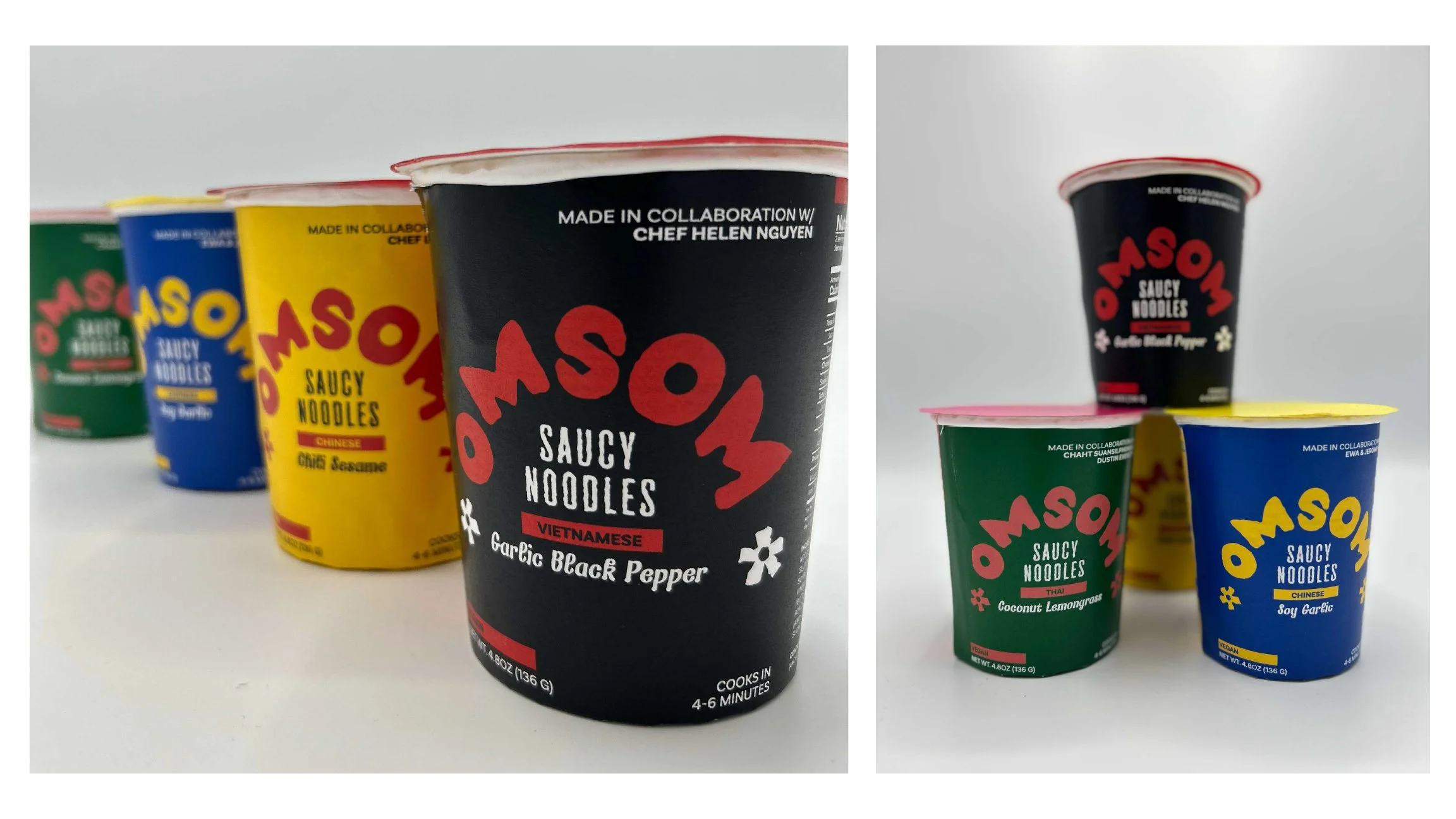
Daniel Gentner
For this project, we chose a grocery store item to examine and redesign, and I chose Omsom's Saucy Noodles. I created a color palette that was inspired by Vietnamese hand painted store signs, which is also reflected in the typography choices of the packaging.

Emily Penrose
A rebrand of "Karine & Jeff" soup with a more delicate, authentic design with reference to French cuisine and intricate print details that introduce a warm, homemade essence.

Maddy Podolnick
For this project, we had to pick an item from the grocery store and redesign the packaging. I chose a brand of noodles called Omsom. I wanted to capture the wavy shape of the noodles through the typography and through the shapes I used in the box's cutout and the gradient pattern.

Alex Pessolano
For this project we were tasked with finding a product in a grocery store and rebranding it using only type and color. For this I decided to choose a can of giant calamari and rebrand it using typography influences from fishing boats in the area the calamari was caught.

Riley Gallagher
For this project, I chose to redesign the packaging for King Arthur's Gluten Free Ultimate Fudge Brownie Mix. The original packaging was mostly white, with a few blue accents, black type, and images of brownies. I wanted to keep the blue, white and brown of the original packaging, while redesigning it using only typography. I created hand drawn type to capture the texture and shape of the fudgy brownie batter.


