SENIOR SHOWCASE
Accessible Tourism
Project Description


Ashley Anousaya
loop is a tool who’s goal is to foster an easier form of communication in nightlife for people with a hearing impairment, which ultimately benefits everyone in the club. The goal is to create connections and keep all parties and stakeholders in the loop by networking with clubgoers, staff members, djs, etc. loop is a bracelet connected to a digital app that helps make ordering easier, find your friends faster, and even connects to external applications such as uber and lyft. Everyone in the club receives a loop bracelet to avoid any feelings of exclusion to create an empathetic approach to support everyone involved. It also has a sign language component to give an educational opportunity for club goers and staff to learn popular and frequently used sign language to avoid any discomfort or misunderstandings among people who sign to communicate.

Samantha Barkholz
This project was based on designing for accessibility. We partnered with OT students to narrow in on a sector of tourism and lack of accessibility and designed a solution for it. I decided on leisure tourism and the difficulties of travel for families and others who may have a child on the autism spectrum. Many families don't even take family trips because of the struggles that occur, so I wanted to design a travel kit to aid with all sorts of stimulation and issues.


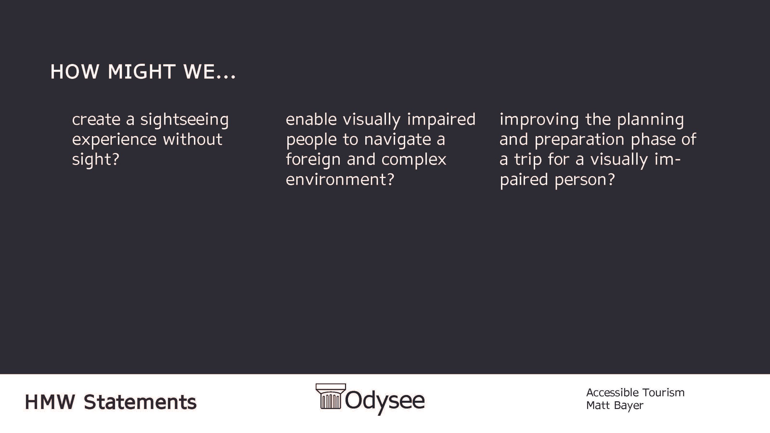


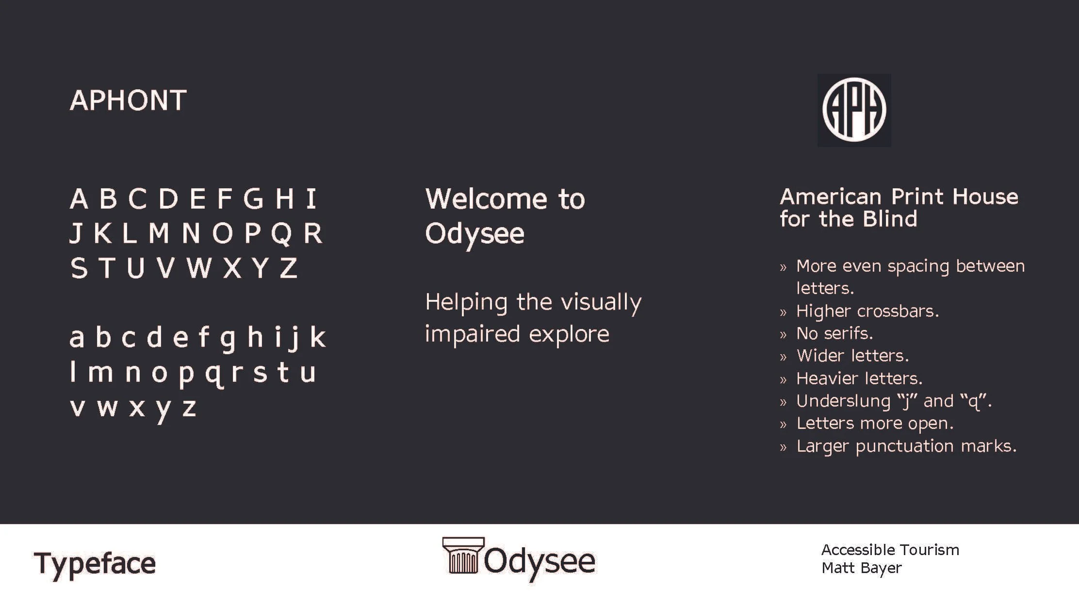


Matthew Bayer
For this project, I designed a system to help visually impaired cultural tourists enjoy a trip to Athens, Greece. The design focused heavily on tactile elements to enhance the site-seeing experience, including a raised tactile map and 3D printed temple. Besides the tactile, a navigational app designed for visually impaired users would help them navigate the sites.


Jordan Bethea
In addressing the challenge of accessible tourism, my focus on agro-tourism led to the creation of Pick&Mix—a solution enhancing the harvesting experience for the visually impaired. This innovative farm-to-table experience incorporates ergonomic handles and interchangeable tools for a safe and seamless use in both farm and kitchen settings. Prioritizing legibility, I employed simple sans-serif fonts, while the user-friendly app integrates bold, contrasting colors and an enlarged visual UI. Pick&Mix not only provides a tactile and inclusive experience for the visually impaired community but also ensures a harmonious blend of functionality and aesthetics, contributing to a more accessible and enjoyable tourism venture.


Daymond Chan-Green
Hoop Sense is a Accessible Tourism service that was created to help enrich the NBA All-Star Basketball experience for the visually impaired.


Daniel Gentner
Vibrino is a Tuscan vineyard experience that was designed with the deaf and hard of hearing in mind during the design process. A design system was crafted in order to esaier facilitate communication between guests about the wine they are tasting. This design system uses shape icons and colors to communicate aroma and tasting notes, as well as type of wine.


Alex Pessolano
For this project we were tasked with creating a brand or service that helped to create a more accessible experience for people with disabilities when traveling. The solution I ended on was a brand called sound bird that made national parks and nature preserves more accessible for birders who are visually impaired. For my system I decided to focus on the john james Audubon wildlife center and decided to create an updated map with brighter colors and bigger more legible type. I also created a book that corresponds with signs that mark the trails with large images and big type to allow for easier reading. There are also buttons on the sign that allow them to press and hear the sounds of the birds that are more likely to appear on that trail.


Aidan Roe
Skål is a company creating new ways to experience beer and beer festivals for visually impaired people. This project is a comprehensive tactile system that doesn't rely on Braille. Each beer has their own pattern with a raised print which is exhibited on the beer cans. The beer flight is fully customized to increase ease of use for a visually impaired person at a beer festival. The colored coasters in the flight have tap technology to bring beer festival attendees to an app where they can learn more about beer. The app is accompanied by a screen reader assistant for the visually impaired.


Erika Sheehan
How might we: enable the ease of the physically disabled in small/tight spaces, improve knowledge of navigation of a specific area prior to arriving, create a way to maximize independence of the physically disabled while traveling. These are some questions that Pinwheel aims to achieve through its app and website experience. Pinwheel is a company dedicated to improving navigational challenges faced by travelers with physical limitations. Traveling with a wheelchair user myself, I see the struggles and roadblocks it may cause while traveling. Pinwheel is created to reduce restrictions when traveling as or with a wheelchair, crutches, or motorized wheelchair user and maximize independence. We strive to empower individuals, enhance their independence, and boost their confidence to fully embrace the joys of travel.


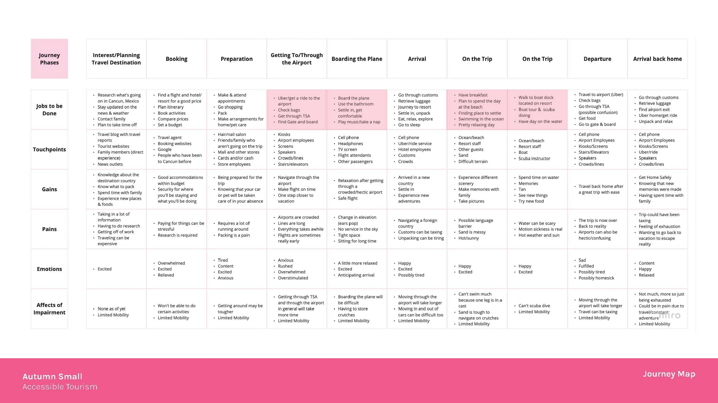


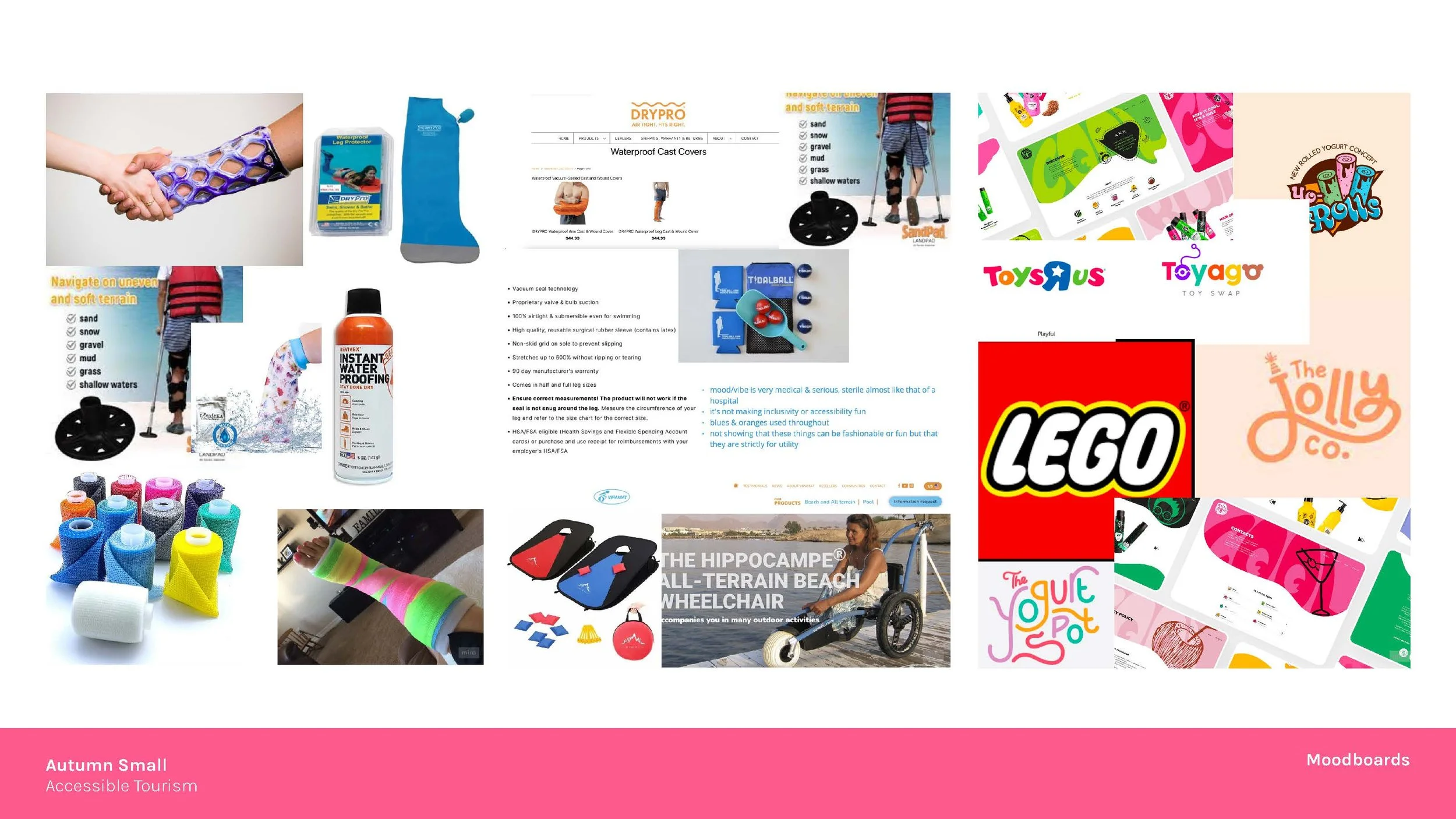


Autumn Small
For this project we were tasked with choosing a disability and designing a specific sector of tourism surrounding a person who has the disability that we selected. Throughout our research we gathered a lot of information and in collaboration with our occupational therapy counterparts, we were able to design products and services that could adequately cater to the personas we created for our specific disabilities. I designed for persons with limited lower mobility who were traveling to tropical places with beaches and water.


Sienna Viera
Fusion is a cultural culinary kit that focuses on making culinary travel more accessible, especially for those with ADHD. Fusion breaks down the cooking experience for younger users to be able to learn more successfully, develop necessary life skills, and experience various cultures from the comfort of their home The website allows for a range of locations to come directly to the comfort of you or your loved one's home, and helps you keep track of locations visited and tracks the progress those logged in with Fusion have made through the checklists.This kit allows for younger users with ADHD and for others with mild cognitive issues to develop their skills in a non overstimulating way, while still giving an exciting new experience.

MJ Carafa
At Ambulate, we understand that planning a visit to a hospital can often be a complex and overwhelming experience. Whether you are coming in for a medical procedure, visiting a loved one, or seeking help from our facility; we want to make your journey as smooth and stress-free as possible.
Blurring Boundaries
Project Description


Ashley Anousaya
Hardena is a family owned restaurant striving to establish the feeling of harmony. Hardena represents a welcoming space for communities to enrich themselves in the traditions and boldness of Indonesian culture, specifically through a culinary approach. With this rebrand, we strive to maintain the culture in a contemporary way to introduce new audiences to the flavors and blends of Indonesian culture. Stylistically the brand uses a variety of mixed media, layering, and blending to capture the idea of multiple identities living in harmony. The mural wall aims to capture a mixed media approach using wheat pasted images of family and culture to capture the low brow of street food, along with transparent acrylic signage, and artistically crafted posters. The menu layers with organic waves to mimic the free flowingness of harmony along with the island feel of waves and water. Plating is also a big part of the culture which is why those were the brand assets we chose to create.


Samantha Barkholz and Maura Fallon
We were assigned a culture and Philly restaurant to explore, learn about, and redesign. We partnered with Interior Design students for the redesign. We had Ethiopia and the restaurant Abyssinia. We rebranded the restaurant and created multiple deliverables and a new space with our ideas and system.


Matthew Bayer and Daniel Gentner
Blurring Boundaries was a collaborative project between interior design and VCD, where we rebranded an Indonesian restaurant called Hardena. First steps included visiting the current restaurant and researching the culture. The rebranding system included a new logo, color palette, menus, a food truck, and for the interior space - wayfinding signage and a graphic wall.


Jordan Bethea
Welcome to Manakeesh, where each bite is a celebration. Assigned with visually elevating a restaurant while preserving Lebanese cultural authenticity, my individual role in this group project entailed crafting a successful branding system that embraces Lebanese cuisine through an elegant concept. Drawing from Lebanese interiors, I developed a nuanced color palette blending bold and deep tones with light and airy shades. Ensuring inclusivity, I designed both an English and Arabic logo—the latter inspired by Arabic calligraphy, using thick and thin strokes to communicate sophistication. A pattern, influenced by Lebanese design, and seamless Arabic language integration throughout the branding were complemented by posters and illustrations celebrating Lebanese culture, cuisine, and native animals.


Kayla Brown
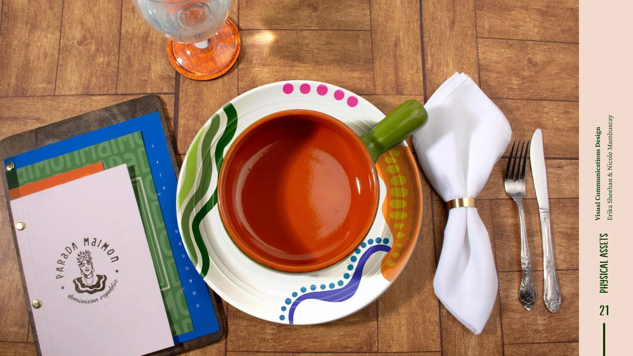
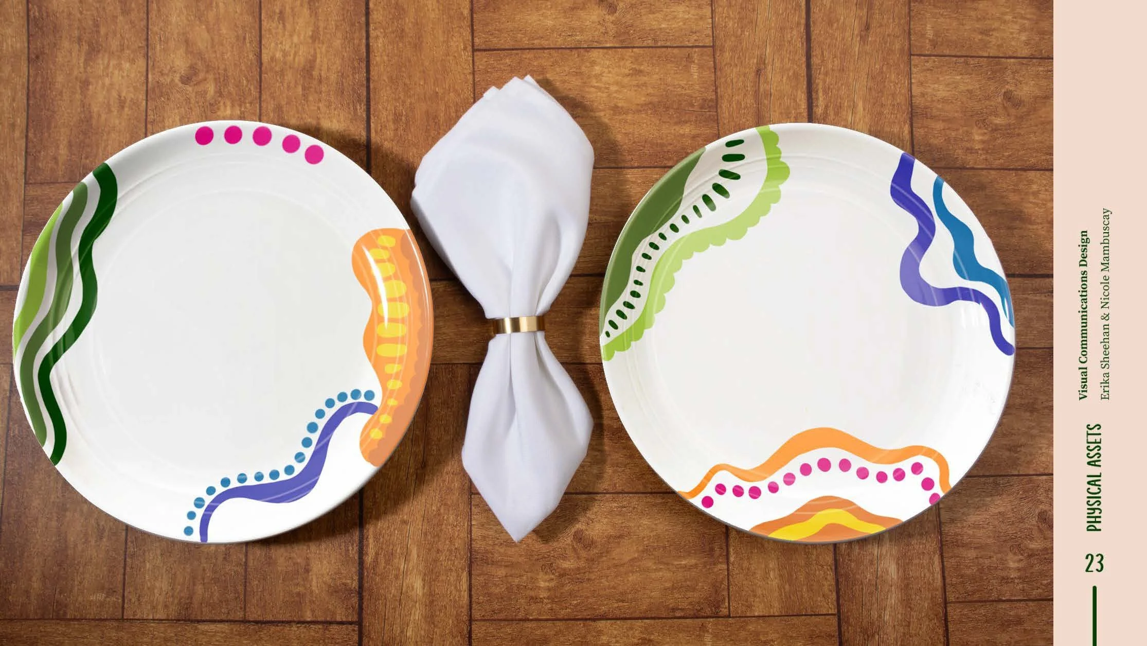
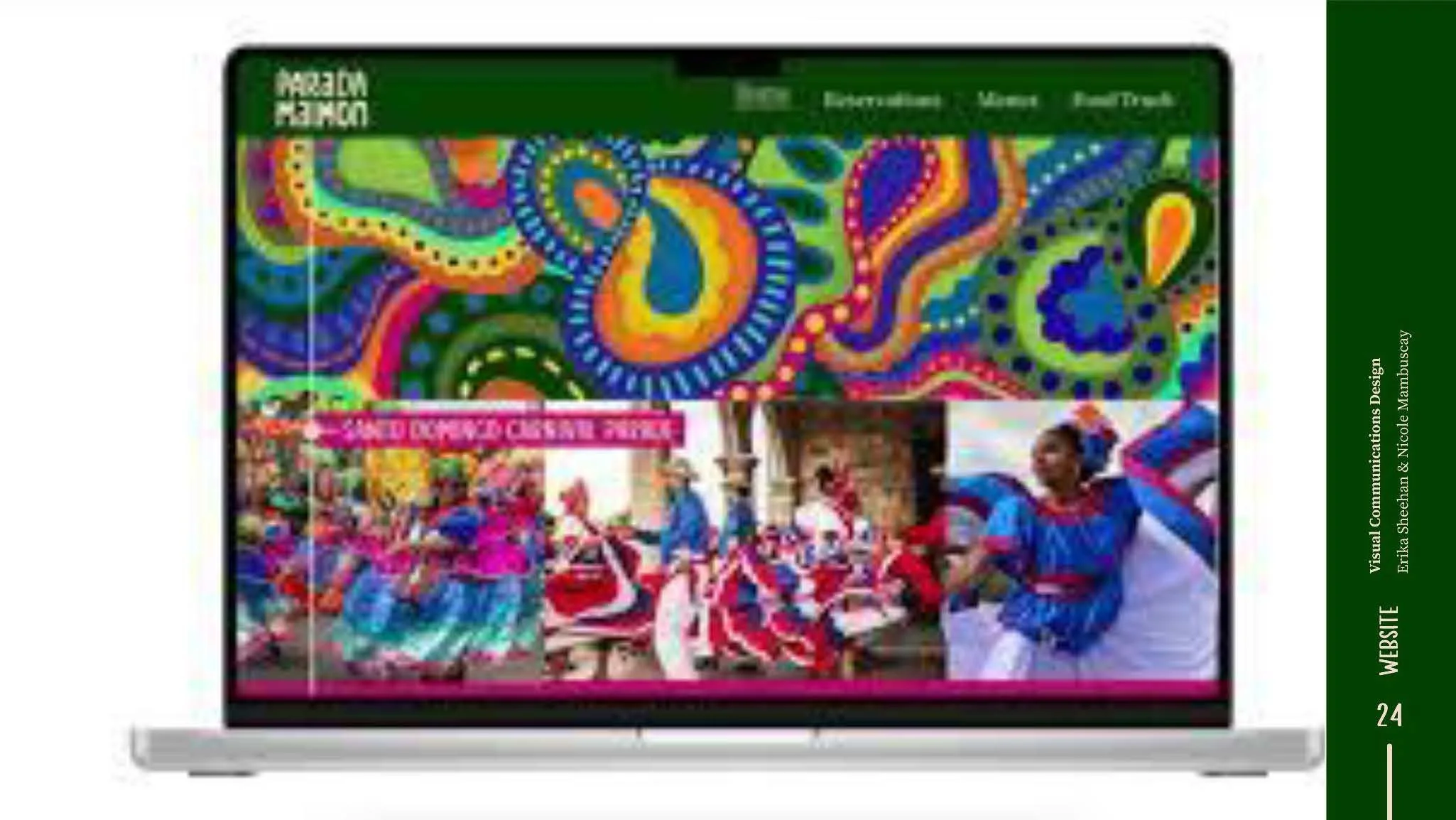
Parada Maimon is a restaurant in Philadelphia that serves Dominican food in an authentic, fun, and welcoming environment. My redesign comes from the vibrancy and boldness of the Dominican Republic. Through analyzing and studying its food, traditions, naturality, and neighborhoods, I created a design system that takes inspiration from the houses of Santo Domingo and storefront signage of the island. This can be seen in the menu, the typography, the logo, brand assets and its translation to the physical components (sandwich board, juice packaging, to go packaging). By harmonzing the textured illustration style with the bold color blocks, it spotlights parts of the culture and brings the immersive component of Parada Maimon to the viewer.

MJ Carafa
Together, INTD and VCD student groups are tasked with researching, conceptualizing, and designing a comprehensive and cohesive design system for an assigned restaurant. We designed a concept that would incorporate the community, life and movement of West African culture.


Daymond Chan-Green
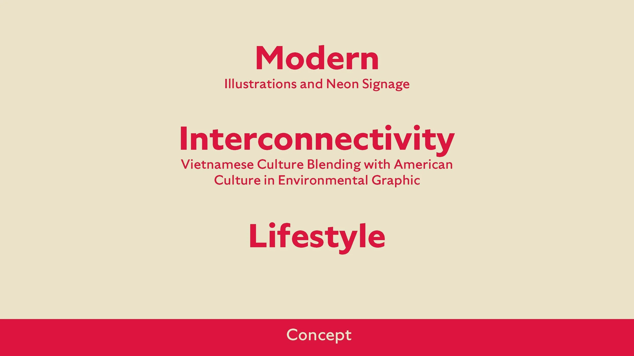
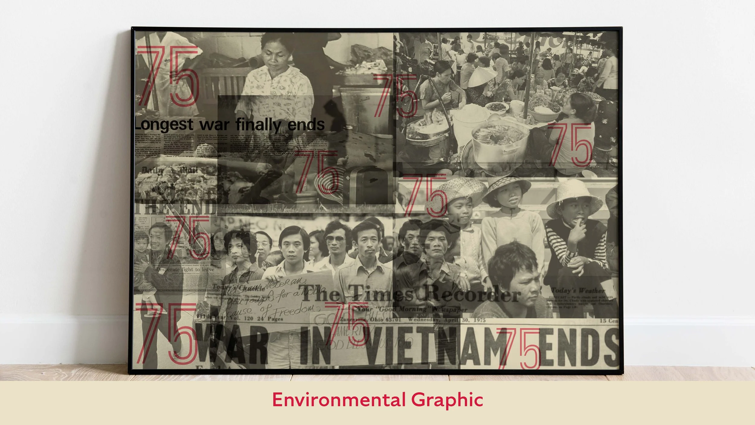
This project was a collaboration project between graphic designers and interior designers. We focused our Blurring Boundaries Project on Vietnamese Culture and task with redesigning and rebranding the Pho 75 restaurant.


Emma Maddaluna
Working with interior design students we were tasked to create a restaurant based on a particular culture. For this project I chose, West Africa which was then narrowed down to focus on Nigeria. The restaurant, Suya Suya named after traditional street food, is an experience for the customer as they are able to connect with aspects of Nigeria and experience their traditional food.


Nicole Mambuscay and Erika Sheehan
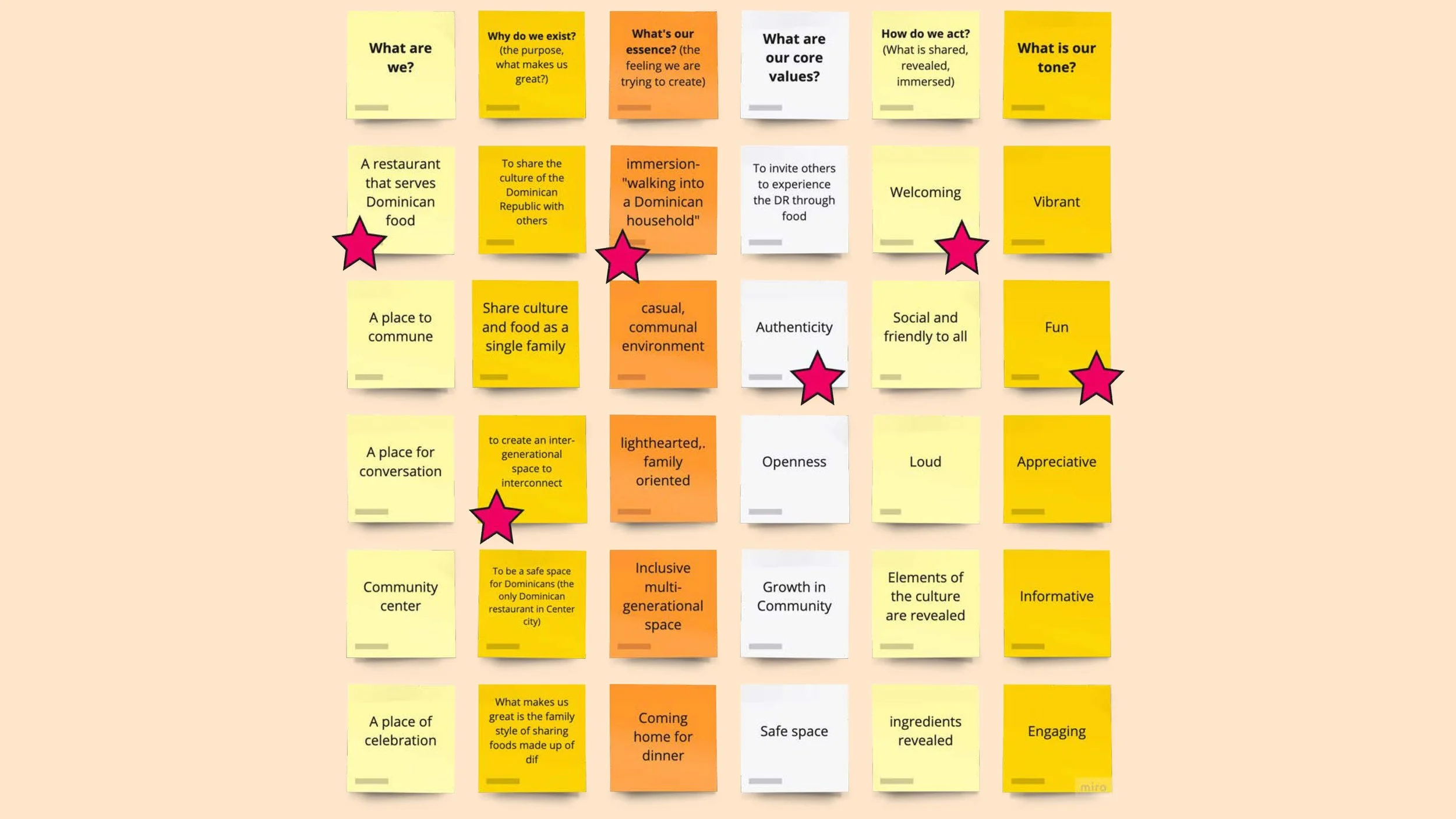
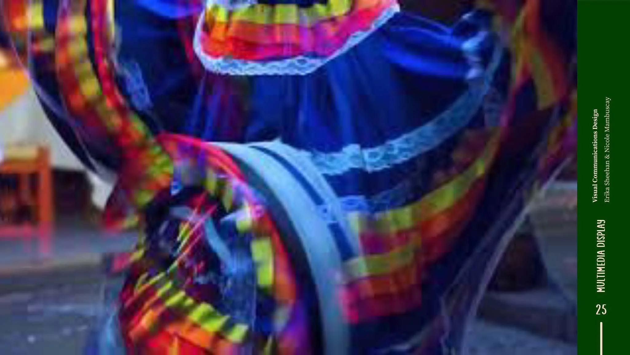
"Blurring Boundaries" aims to transform Parada Maimon, an established Dominican restaurant, by seamlessly integrating graphic design and interior design. We were faced with the challenge of redesigning this space while capturing the rich essence of Dominican culture. Our solution involves a harmonious collaboration with interior designers based on the theme of dance and movement. Through strategic visual elements we seek to blur conventional boundaries, creating an immersive dining experience that is lively and pays an homage to its heritage. This approach blends the traditional with contemporary, immersing the customers in the essence of Dominican culture. The project provides Parada Maimon with a distinctive identity that resonates with the vibrance of the culture and the importance of dance and celebration in the Dominican Republic.


Alex Pessolano and Aidan Roe
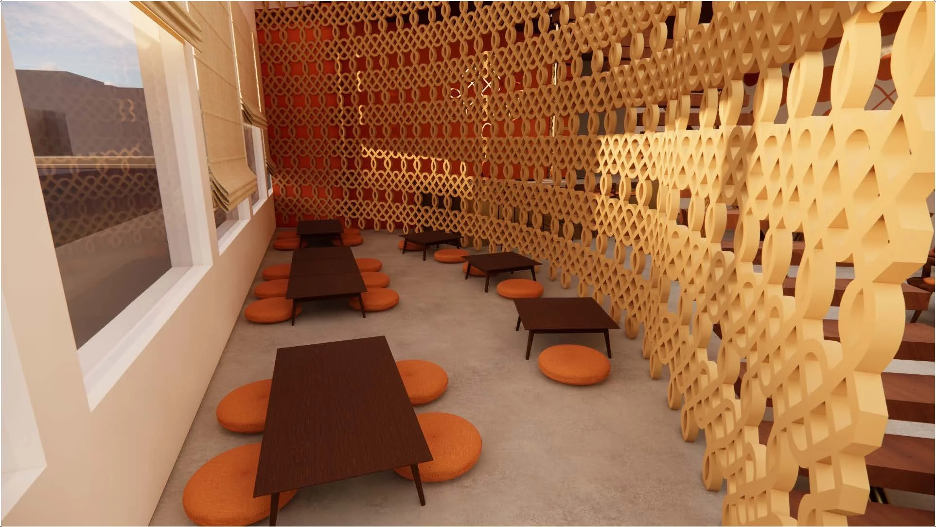
For En Carbón, we collaborated with two interior design majors to design a restaurant experience that is reflective of Colombian culture. We started with extensive research into Colombian culture, history, etiquette, and food. As a group, we found a few key pieces of inspiration such as sombremesa, indigenous heritage, and sign painting. In our brand, we wanted to tie in these concepts with the dining experience.


Autumn Small
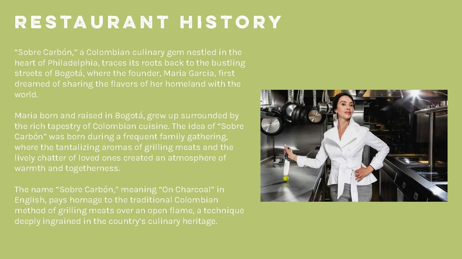
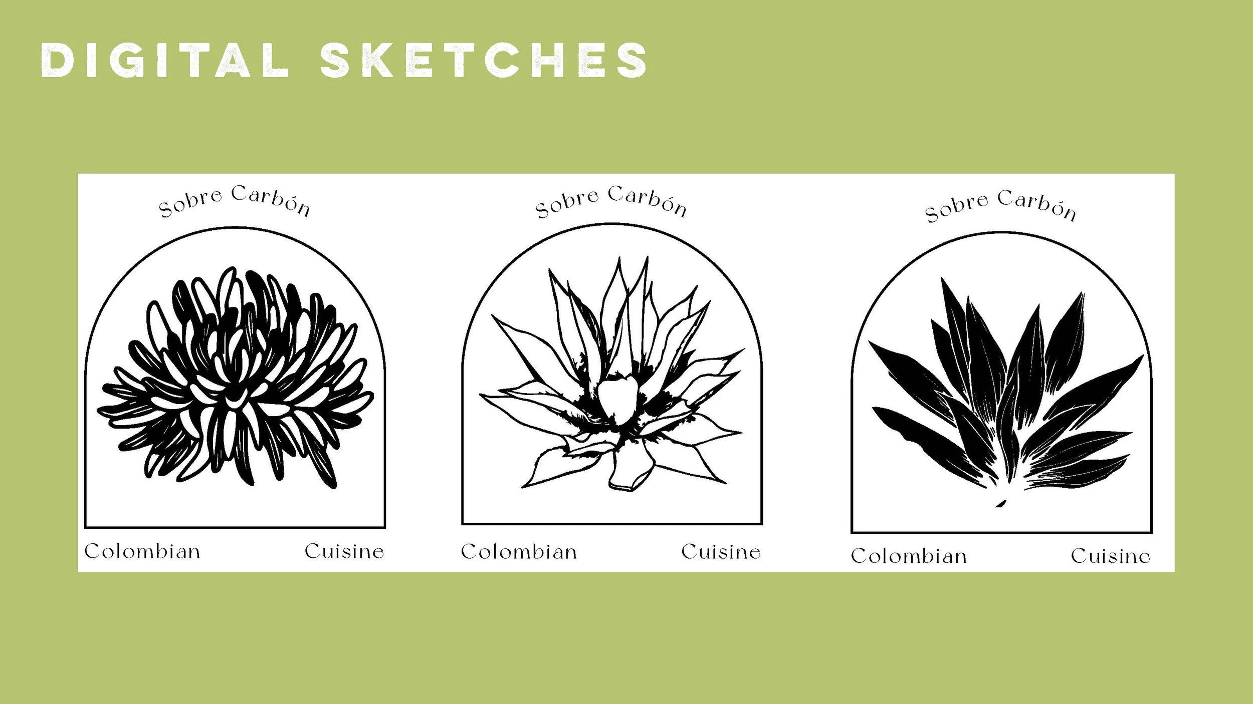
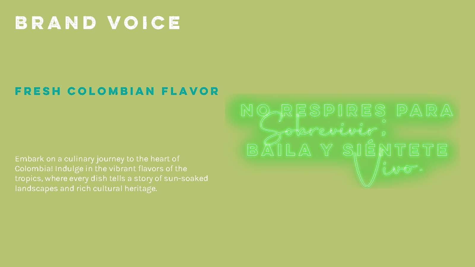
For this project VCD and INTD students were tasked with researching, conceptualizing, and designing a comprehensive and cohesive design system for an assigned restaurant that represents a unique cuisine. In this case we worked with Colombian cuisine for a restaurant called On Charcoal which we renamed Sobre Carbon. I was in charge of the branding and graphic elements for the restaurant while my interior counterparts tackled the overall design of the restaurant.


Blake Turner
This restaurant rebrand began with experiencing the food and culture of Lebanon at the popular Lebanese restaurant, Manakeesh. This establishment serves the University City area of Philadelphia with typical Lebanese street foods like falafel, hummus, and it's specialty: manakeesh. The creative direction of this rebrand is focused on appropriately using inspired designs from Lebanese culture (i.e. Arabic script, tile-work, triforia & lattices), while considering the future location of the restaurant in Old City. Modern design considerations like form and balance are at the core of this project, allowing the bold patterns to speak for themselves.


Sienna Viera
With interior design partners, we were tasked with researching, conceptualizing, and designing a comprehensive and cohesive design system for our assigned restaurant Tiffin. The goal was to make a system that maintains cultural authenticity, but aims to cater to a broader audience. We worked to make our design system harmonious and communicate the essence of South India, through our graphic and interior touch points. Through our research of South Indian culture and the experience of dining at Tiffin, we created a system that emphasized the intricacy of the culture and the natural elements we experienced. As the graphic designer, I created a logo that represented various parts of South Indian culture, through the motifs and religious symbols they find most important, while also brining in other elements of cultural significance found within festivals and architecture.