JUNIOR SHOWCASE
Rebrand Logo System
In this project, students designed a series of identity marks intended as a rebrand of a local Philadelphia organization.


Allison Cravo
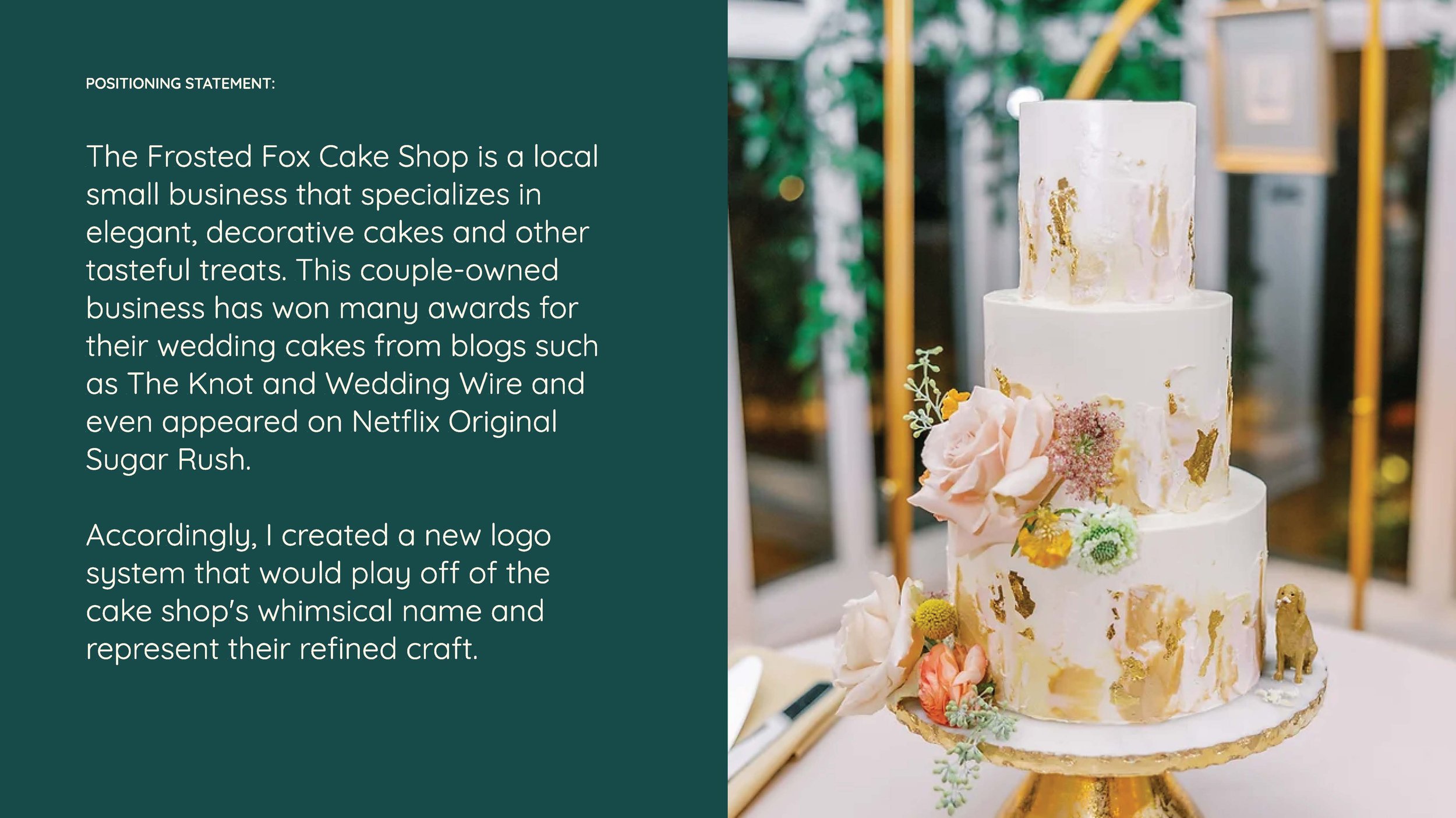
The Frosted Fox Cake Shop is a local small business that specializes in elegant, decorative cakes and other tasteful treats. This couple-owned business has won many awards for their wedding cakes from blogs such as The Knot and Wedding Wire and even appeared on Netflix Original Sugar Rush.
Accordingly, I created a new logo system that would play off of the cake shop's whimsical name and represent their refined craft.


Samantha Gaiser


Joelle Klouda
Sky King Fireworks is a Philadelphia based business that provides exciting firework packages. They value fun for the whole family and having the best bundles for affordable prices. I designed them a new logo system that displays family values, explosive products, and royal imagery.


Maddy Podolnick
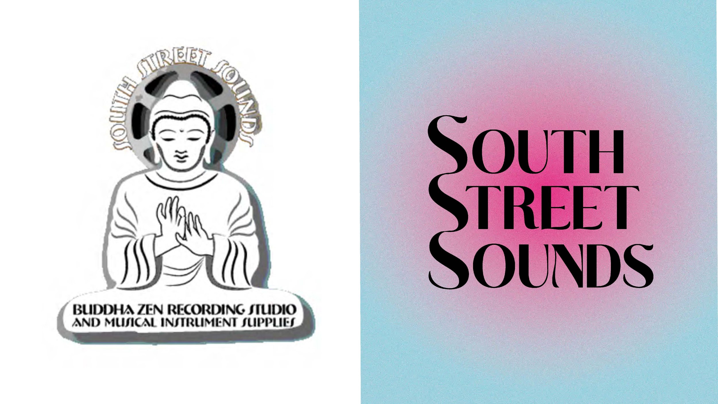
For this project we were tasked to create a new brand identity for an existing business. We needed to create a new logo system that successfully conveys the message of said brand. I was assigned a local music store and recording studio called South Street Sounds. For the new logo system for this brand I wanted to go off of the idea of a visual representation of energy or sound wave movement. To do this I used the S at the beginning of each word in the name of the brand and connected them to create a soundwave-like shape. I also used brightly colored gradients in circular shapes to indicate energy and movement radiating.


Emma Prushan
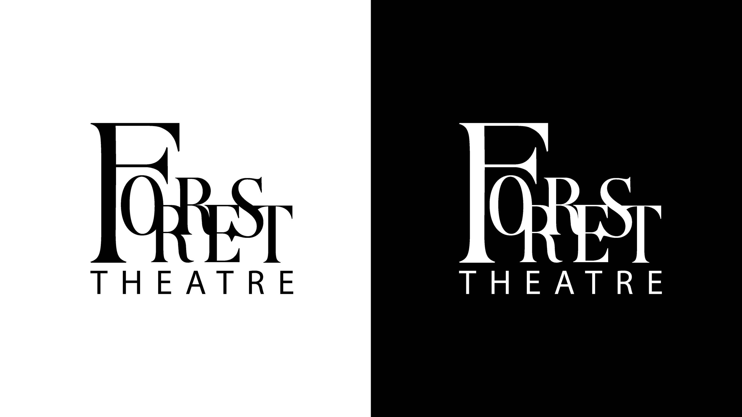
For this project, we were tasked with creating a new logo system for a Philly business. I selected the Forrest Theater because of my experiences seeing productions at the theater and its rich history. I created a new logo system based on the collaboration that is essential to productions at the Forrest Theatre, beginning with the Shubert Foundation and Kimmel Center and including the performers, audience, crew, and more.


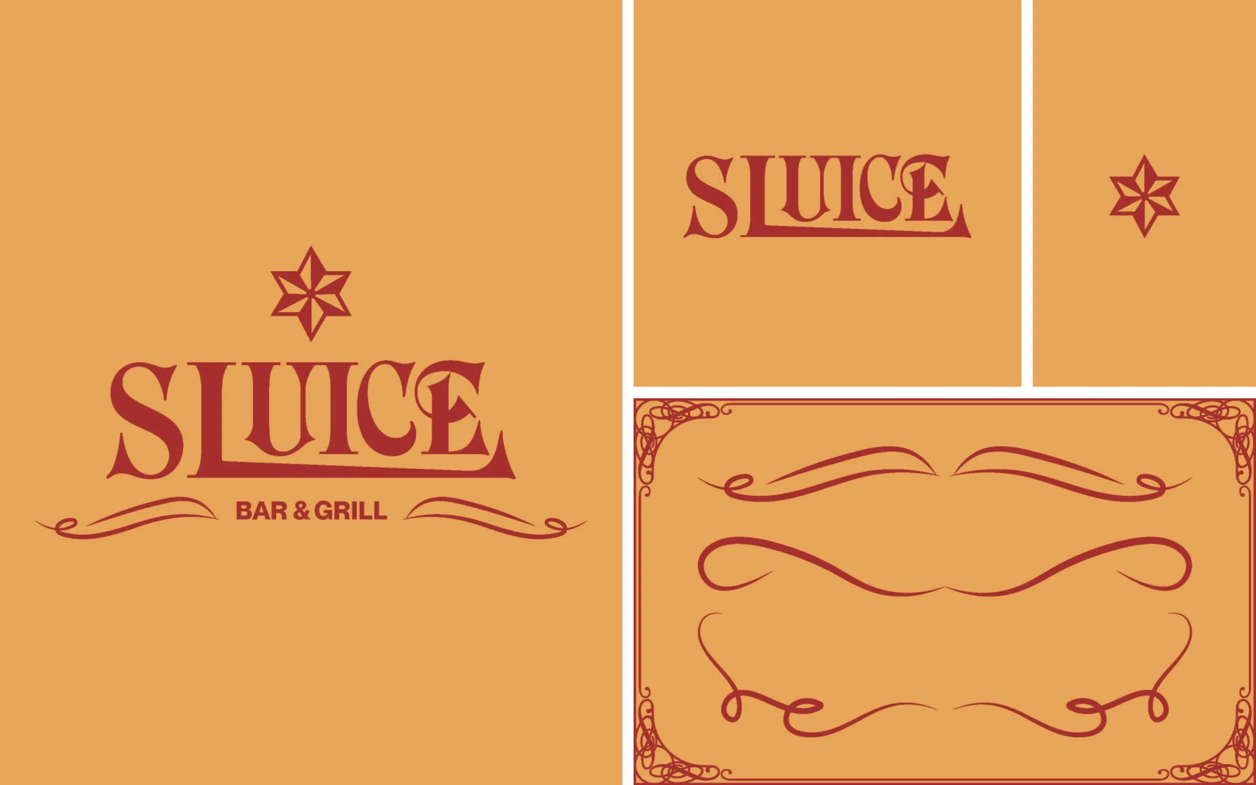
Hailey Riley
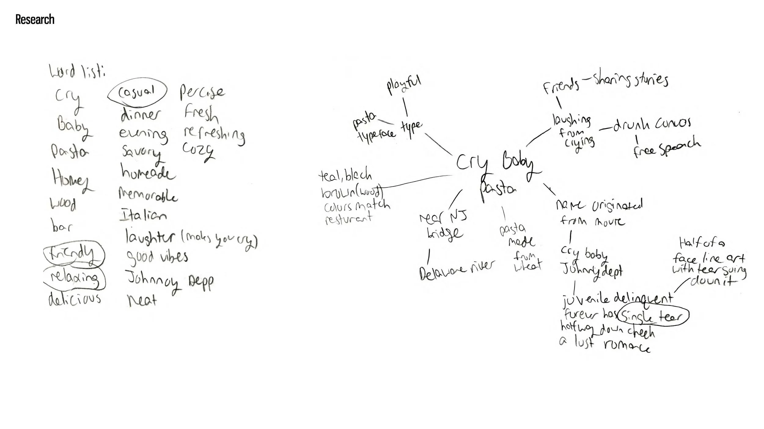
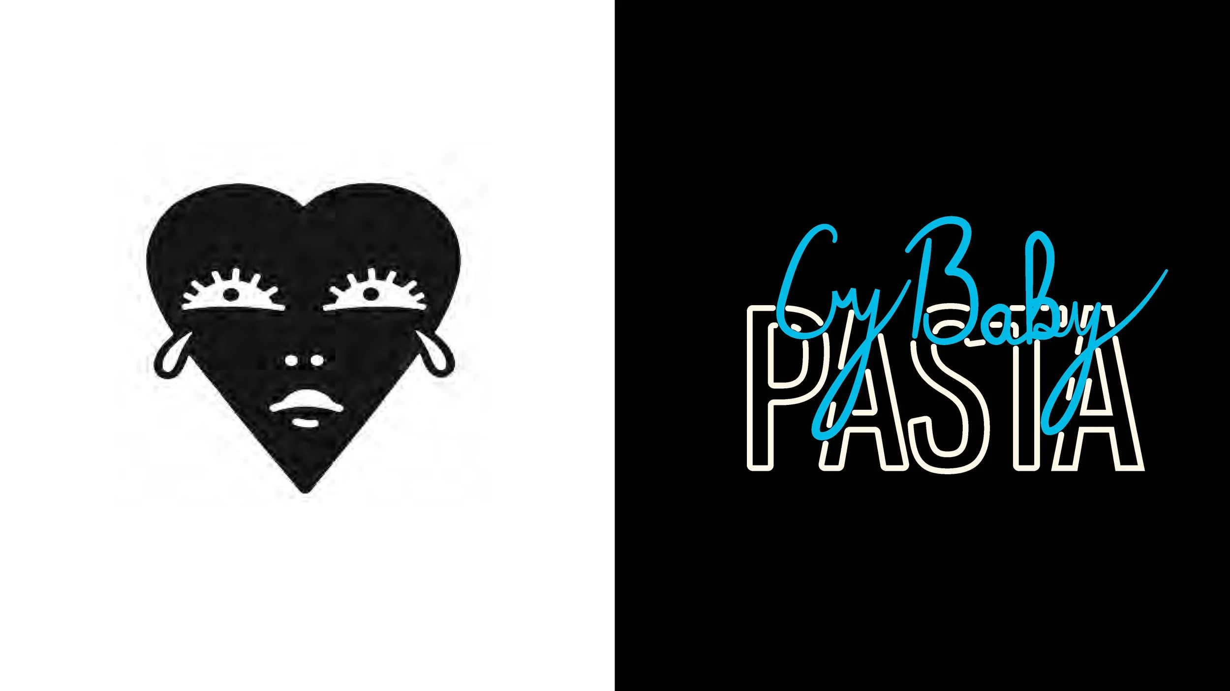
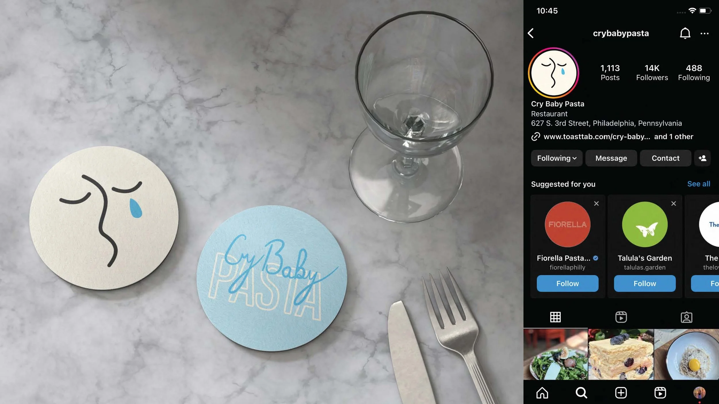
Causal, Friendly, and relaxing, all words represent Cry Baby Pasta and how I decided on my direction for the logo redesign. Cry Baby Pasta is an Italian restaurant in Philly, that specializes in pasta but also has a cocktail bar. The restaurant has a warm welcoming environment that’s perfect for a meet-up with friends or a first date. With this in mind, I wanted the logo to be fun, playful, and friendly, so for the primary logo, I designed a wordmark using a tall sans serif that intertwines with my own handwriting. For the secondary logo, I removed the intertwining so it is legible when smaller. For the icon design, I focused on the words cry and pasta from the name.


Andrew Sack
For this project, we were tasked to rebrand a local business. The company I rebranded is Then and Again which repurposes vintage antiques. The focus of this project was to go through many stages of iterations and refinements of the logo we designed.
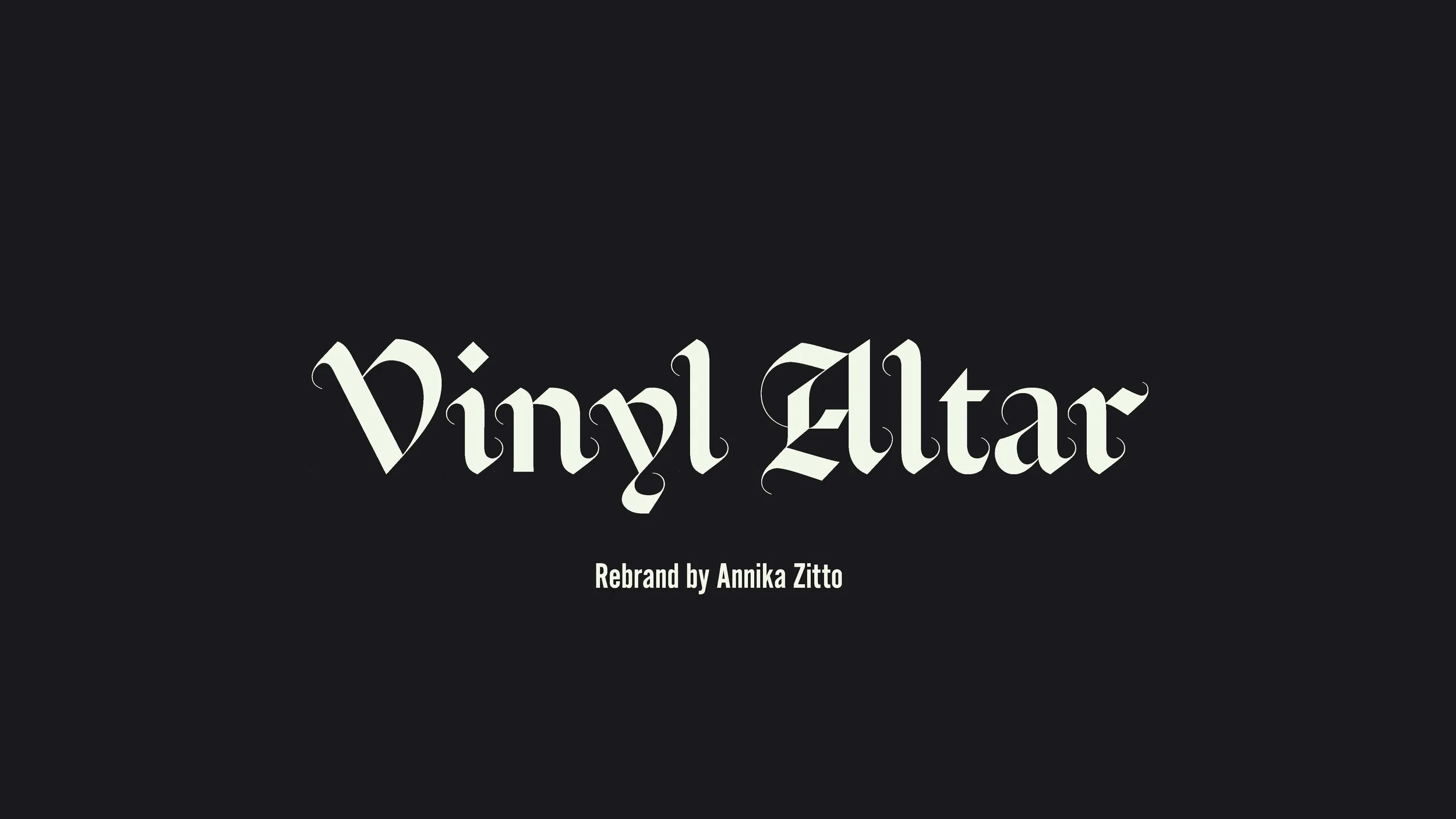


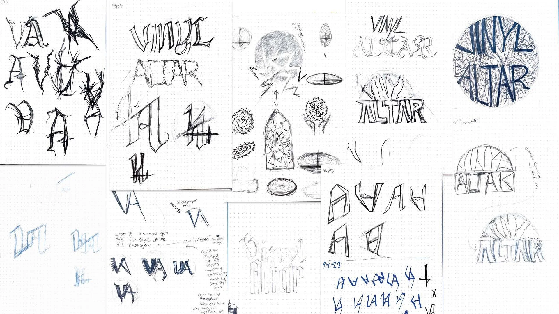


Annika Zitto
I was tasked with rebranding Philadelphia’s own Vinyl Altar, a heavy metal record shop. Vinyl Altar is a local business in Queen Village specializing in Heavy Metal Vinyl. I created a new, refined logo system invoking the heavy metal genre through typographic tropes.
Culinary Experience
The way Americans consume food has been evolving. Societal changes, technologic innovations, and environmental concerns are changing the landscape of food consumption. Climate change has made people question their dependence on meat and poultry. The pandemic has opened avenues for innovation in the way commercial kitchens craft and deliver food for patrons, while also reminding us that the experience of great service in a well-designed space can’t be topped by simply staying at home. New culinary experiences are challenging how we think about food consumption, and strong brands are leading the charge. For this project, students are assigned a food service category at random, as well as a genre to give your culinary experience a point of view.


Allison Cravo
For college students and millennials who are constantly looking for fun experiences in the city, Mischief is the crime themed cafe that they need. With its cinematic brand essence and style, Mischief makes customers feel like they are walking into a movie crime scene whilst deciding their coffee order.

Samantha Gaiser


Joelle Klouda
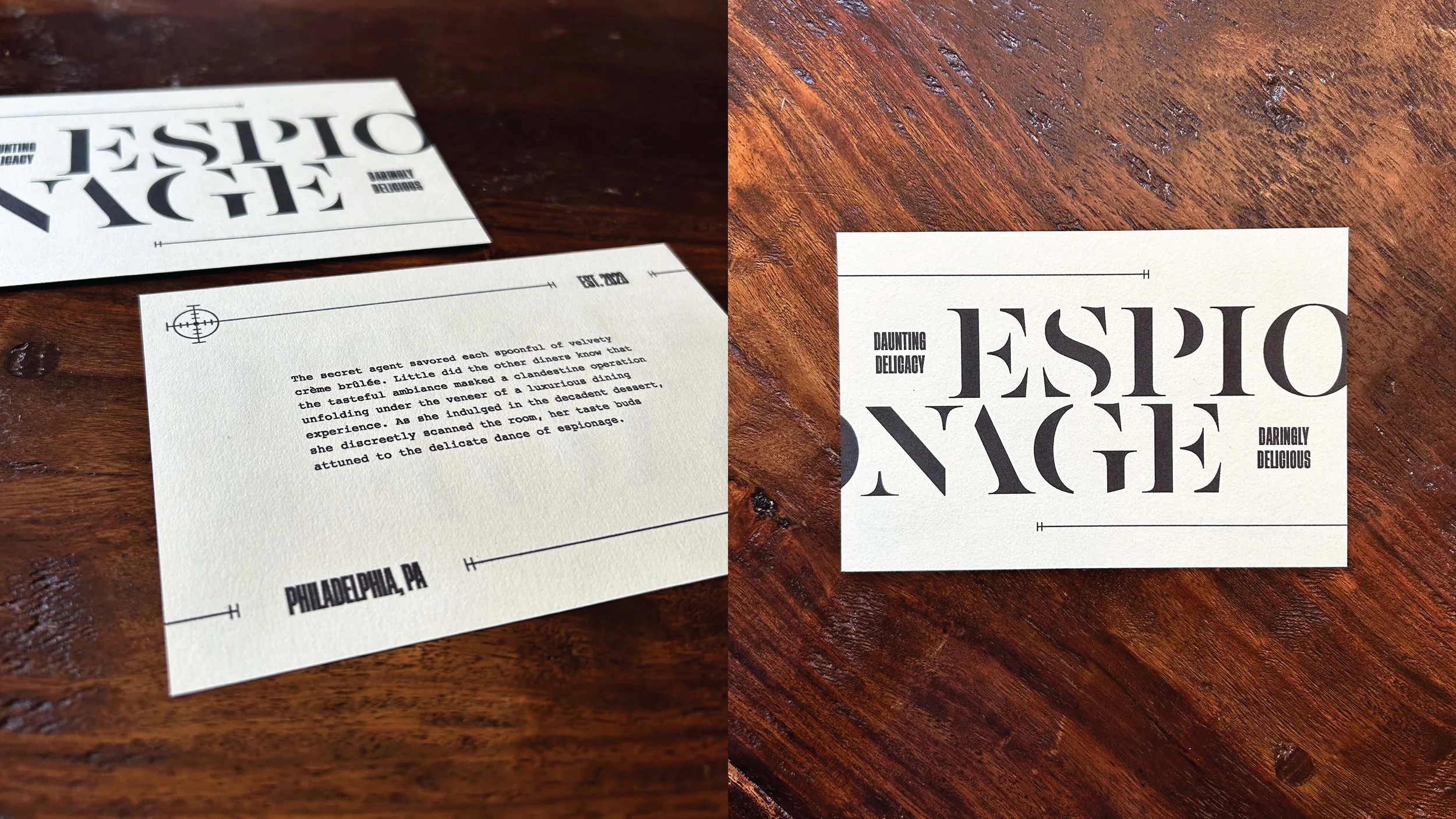
Espionage is a spy themed fine dining experience. I designed multiple different menus that will let guests experience their own spy themed adventure. I took inspiration from spy pop culture and movies. I experimented with different typographic styles on each menu.


Maddy Poldolnick
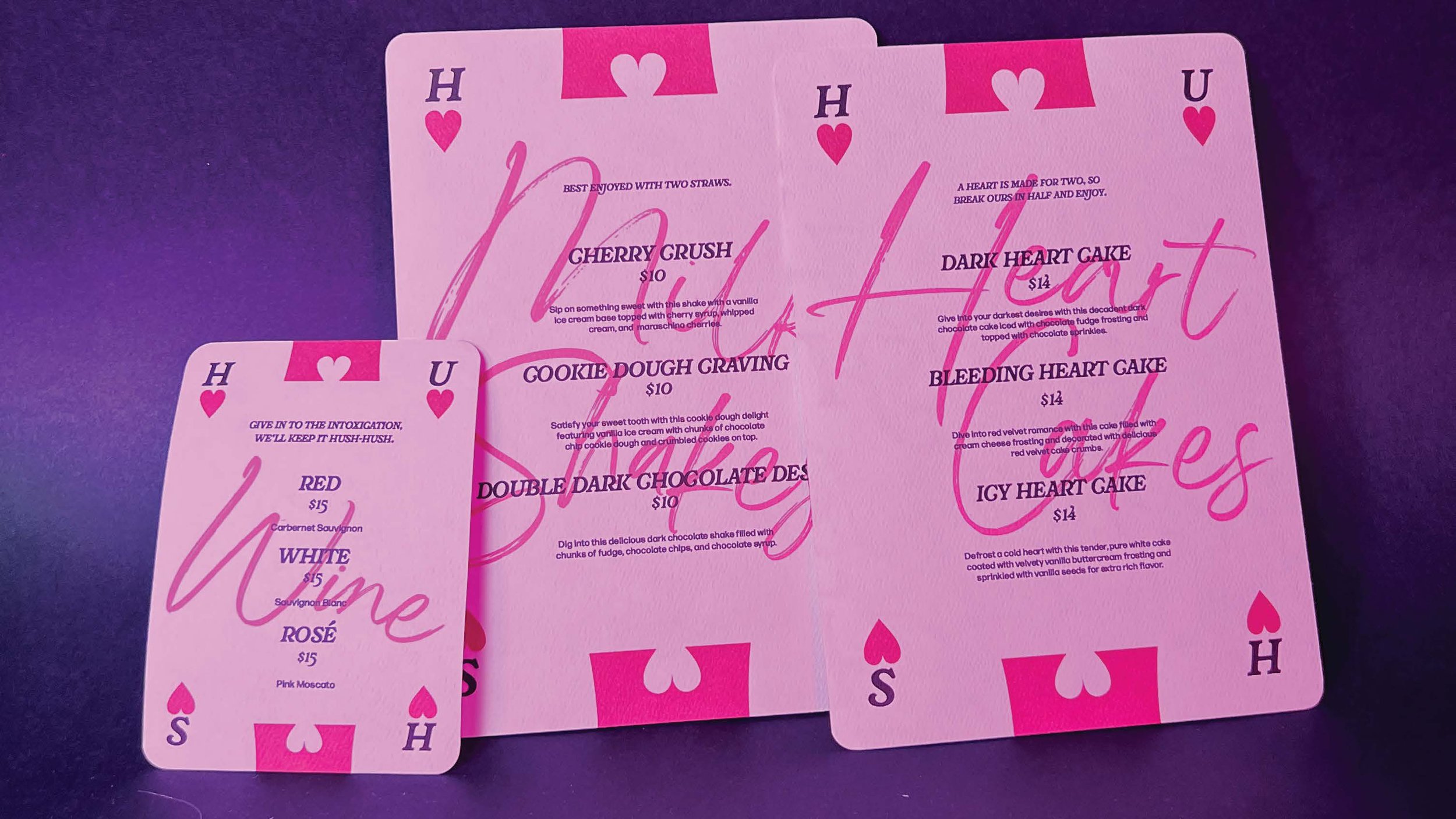
This project tasked us to take a movie genre and a type of food service and create a unique culinary experience. I was assigned the romance movie genre and quick service restaurant type. I created the restaurant Hush, a forbidden love themed late night restaurant. I wanted to lean into the secretive guilty pleasure love idea so I tried to do this with the visual language I used. I used typography that felt handwritten in certain places to give the effect of a love letter, and based my menu design off of playing cards to play on the saying of keeping one’s cards close to their chest.


Emma Prushan
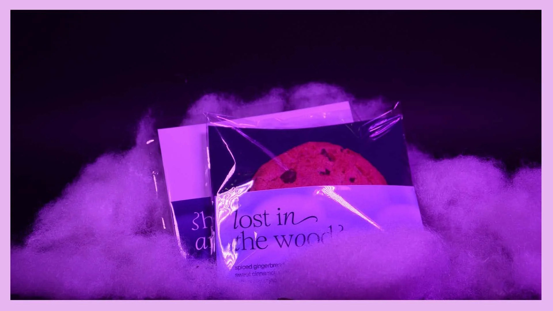
Given the food service type of pop-up and the fantasy genre, I created Charm. Charm is a dessert restaurant with a revolving location and exclusive nighttime hours. Their rich, extravagant desserts and moody feeling is perfect to charm your date or spend a night out with friends. I was inspired by the idea of magic and how it can make something glow out of the darkness when creating my logo mark and the cloud assets used throughout the brand. The word mark uses a combination of italic and Roman letters, with the italic serving to hint at the magical fairytales of the fantasy genre, while the Roman letters remind us that Charm is something modern and rooted in the present.


Hailey Riley
Wave is a pop-up restaurant based on the genre film noir. Each month Wave travels to a different city in the United States. During the day, wave is a brunch spot, but by night wave is a women’s only jazz bar for anyone who identifies as a woman. Since Wave is open during the day and during the night, I decided to have the brand match the feeling of morning and night. Bunch is very bright and relaxing, while the jazz bar has a sophisticated vibe. The primary logo is a wordmark using a typeface that has aspects similar to waves. For the secondary logo, I pulled the A bowl shape and created 5 lines to represent the 5 waves of feminism. The icon is the bowl of the A solid for resizing purposes.


Andrew Sack
For this project, we were tasked with conceptualizing a brand identity for a culinary experience, based off a random movie genre. The culinary experience I was assigned was a formal sit-down restaurant and the movie genre I based my brand concept off of was Western. For this project, I designed the logo system, menu, takeout box, thank you cards and website for this restaurant.


Annika Zitto
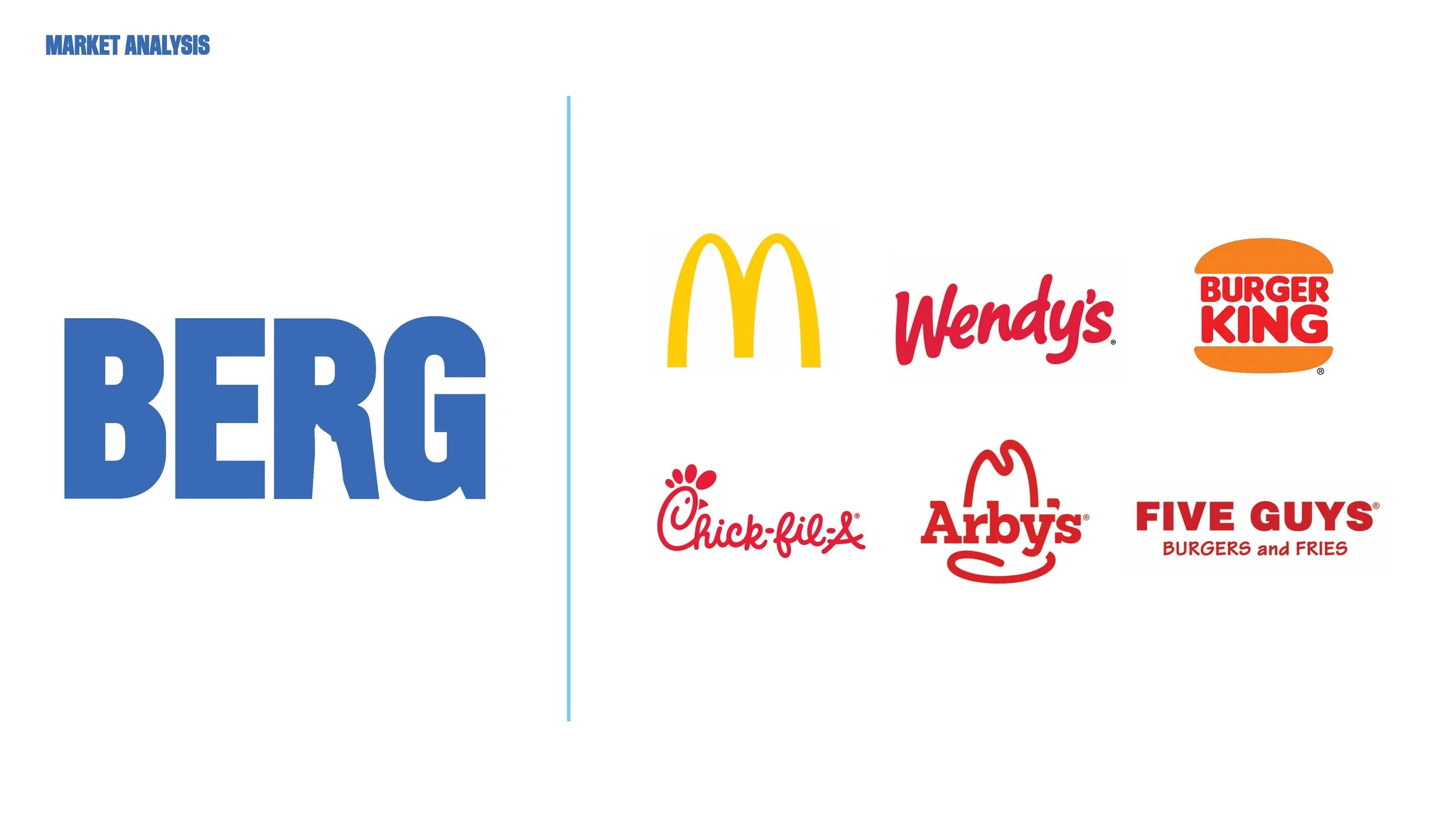
I was tasked with creating a rom-com food truck. I had to figure out how to tie this identity to its specific vegan offerings. I created …Berg!
Berg is an environmentally conscious vegan burger truck. Showing a love for the planet through witty language, Berg brings a lighthearted, “rom-com” energy to the stressful topics of factory farming and climate change.
Forced Connection
“External factors — from economic to cultural, environmental and political — are affecting people more than ever before, making life more complicated and purchasing decisions more multi-faceted,” said Baiju Shah, chief strategy officer, Accenture Song. “There is a growing divide between what consumers need and value and what businesses offer, creating a relevance gap. We believe that companies can bridge this gap and herald significant growth by not focusing on promoting consumption, but in meaningfully contributing to customers’ lives.”
Students were assigned to concept and design an identity, with multiple brand touchpoints, for a wellness, music, or toy industry of your choice. Working in groups, students researched the current market, defined their company, researched and defined an audience, wrote a mission statement, named the company, and collected visual inspiration. Once the company has been conceptualized and defined, students individually developed a full identity system.


Allison Cravo
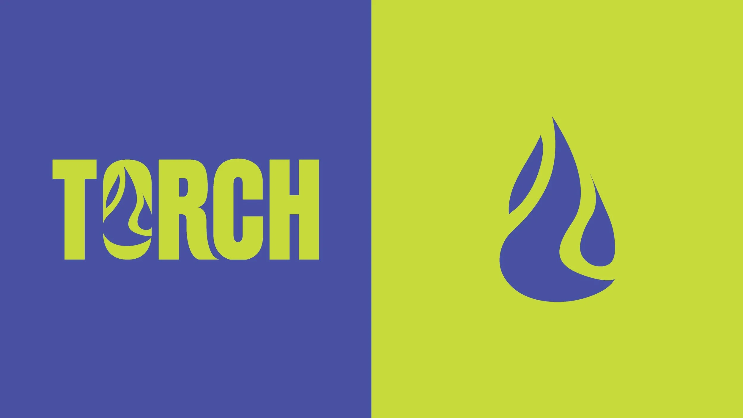
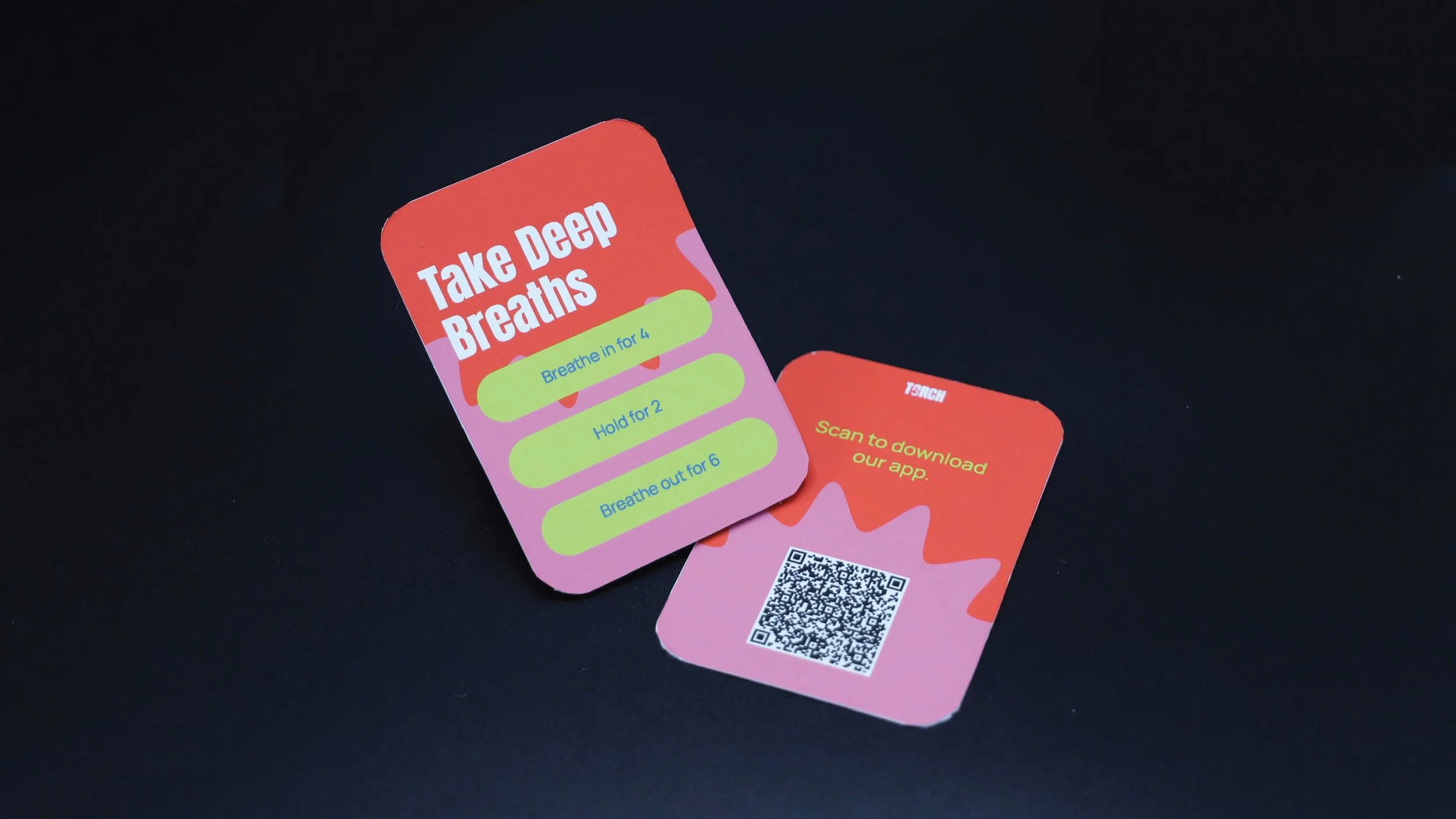
Torch is a festival safety service that works to create safer environments at festivals by providing resources and timely responses for incidents of sexual harassment. Our mission is to create unforgettable experiences by ensuring the safety and well-being of festival and concert-goers. We are not just an event service provider, we are your partner in creating secure, enjoyable, and memorable experiences for festival and concert enthusiasts. Together, we can celebrate the joy of live music, knowing that safety and harm reduction are at the heart of what we do. Knowing that our end user would be gen z and young millennial concert and festival goers, I created an app for easy accessibility to safety resources as well as a poster system to be used throughout the festival and a pre-festival package they would receive in the mail to get excited for the festival.


Samantha Gaiser
Torch is a security company filling the gap between festival staff and conventional police staff


Riley Gallagher
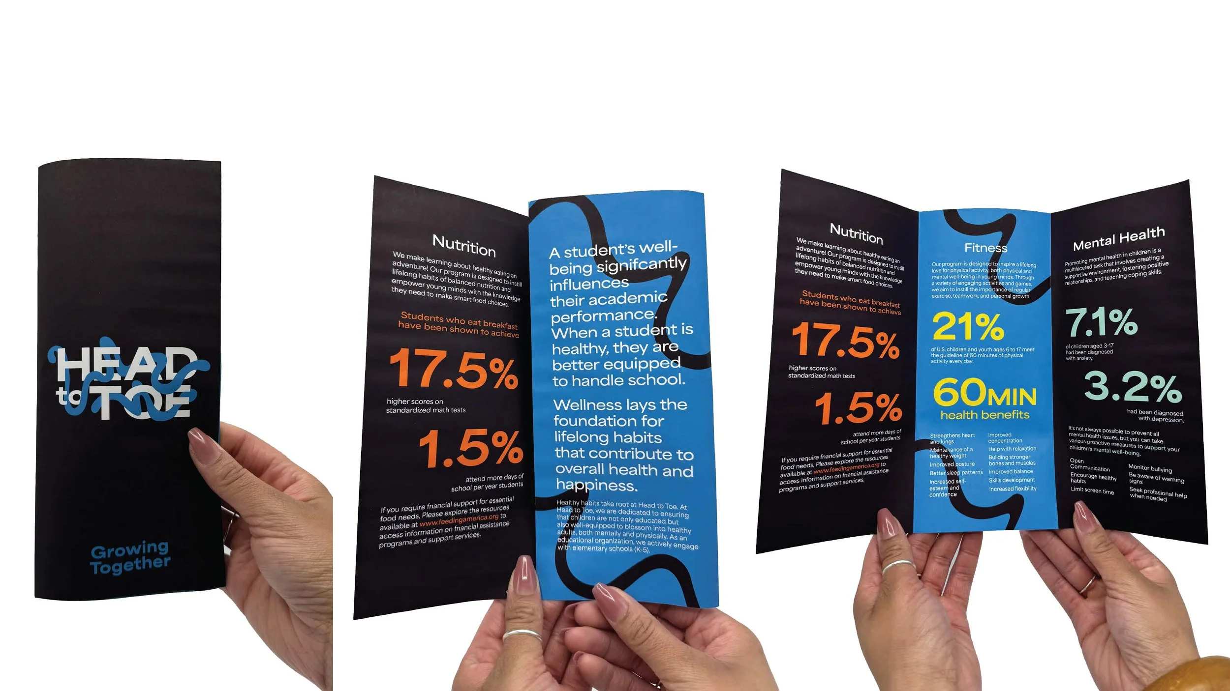
For this project, I was assigned to create and design a brand to help solve a problem in the wellness industry. I decided to create a brand called Head to Toe, a pop up that travels to elementary schools to teach students ages K-5 about mental and physical health, as well as nutrition. Head to Toe would teach students about these important topics in ways that will hold their attention such as doing fun activities and workshops with them.


Joelle Klouda
Torch is an organization providing safety and security from sexual assault primarily at music festivals and concerts. Torch achieves this goal through education, resources, and a security team. Because sexual assault is a delicate and serious issue, Torch utilizes a clear and calm design system while also adhering to the music festival scene with bright colors and bold textures. Torch has directional signage utilizing geometric shapes and a mobile app to help you and your friends stay connected and report incidents.


Emily Penrose
Project three requires the development of an original brand that tackles a social concern. My brand is called "Tinkr", where creativity meets sustainability. The brand includes a logo and type system with original illustrations for stamps as well as a fully prototyped Figma website. This brand development also includes printed components such as a stationary system, delivery box, and a stamp activity journal. Tinkr is set apart from other creative brands because of its highly interactive and customizable products, where the customer can choose their supplies and create landscapes and plants based on these choices, then share their creations to the Tinkr community through the website. Tinkr also offers activity based learning while encouraging enthusiasm about the environment and sustainability with natural themes and ethically manufactured products.


Maddy Podolnick
For this project we were assigned a category and were tasked to create a brand that would solve an issue in this industry. My group was assigned to the toy industry, and we wanted to address the problems of sustainability in toys and relaxation for kids. We created the company Tinkr, a company that creates stamp sets for kids of all races and genders allowing them to relax and explore their creativity. The stamps are made with high quality eco-friendly materials so that they will last a long time and not be just another piece of plastic trash thrown out after a few uses. I used a simple color palette of brown, pink, and green to indicate the eco-friendy nature, but also have a pop of color to keep it playful for kids. I wanted the brand to be friendly and approachable to kids but not overwhelming as many kids brands are.


Emma Prushan
Head to Toe is a wellness education brand that visits schools across the country quarterly to teach students K-5 the importance of caring for their minds and bodies. Head to Toe knows that every healthy living skill a child learns will only make it easier to carry this skill into their adult life, so the brand is committed to ensuring that children are educated and equipped to grow into healthy adults, both mentally and physically. I was inspired by plant growth in my logo system and color palette because I felt that plants and their growth spoke to both mental and physical health, grounding oneself and growing tall and strong.


Hailey Riley
My wellness research group found a lack of education in students for mental and physical health. Our target audience is elementary schools but more specifically, students, teachers, and guardians. Head to Toe teaches students physical and mental health as well as healthy eating habits with the 3 departments fitness, mental health, and nutrition. I focused on the words organic, flexible, energetic, active, and organized chaos to develop the brand. To display Head to Toe the best, I designed the stationary (business cards, letterhead, and envelope), affirmation posters, an infographic for the parents, and a website including an example of an activity. For the brand, I used a wide sans serif for stability and squiggles to bring in a playful vibe.


Andrew Sack
For this project we were tasked with creating a brand that solves an issue in one of three categories (toys, wellness, or music). The category I was assigned was wellness, and my company, Head to Toe, was focused on children's well-being. Head to Toe is a non-profit organization that visits schools to teach children about the importance of physical and mental health. We had to create the logo, a web element/app, and 2 student choice components.


Annika Zitto
For this project, my group was assigned to the music category. We decided how to make music festivals more inclusive. The solution we came up with was Torch: a 3rd party festival safety company that could partner with festival venues to make more people feel safe and welcome at festivals. Torch ensures the safety and well-being of festival-goers onsite. It creates safer environments at festivals by providing resources and timely responses for incidents of sexual harassment and other safety concerns. This includes a reporting application, a tent with staffed by the Torch team, and more.