D3 F21 LP

Ashley Anousaya
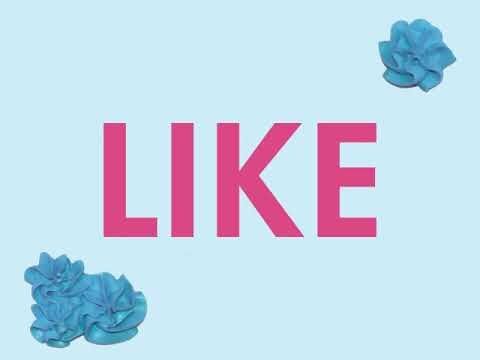
The task of this project was to redesign a vinyl for an existing record. The main goal of this project was to find a way to use type as image to redesign the cover. I decided to redesign Ariana Grande’s “Sweetener” album. I started brainstorming ideas that I associated with the word “Sweetener” and the idea of the word sweet. I created a moodboard to start this brainstorming process with pinks and pastel colors then created sketches to accompany this. I also listened to the album to get inspired by what aesthetics I wanted to achieve. I eventually ended up on the idea of writing the title out in icing to show the bubbly sweetness of the album. I also included candy hearts on the inside to number the tracklist of the album.


Daymond Chan
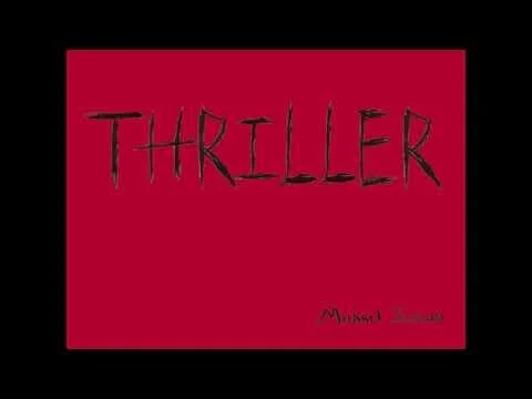
The purpose of this project was to redesign an already existing album of my choice and the album would capture my own interpretation of the emotional and spiritual feeling of the music within the album. For this project we were also asked to make a 2 minute animated lyrics video of one of the songs from the album that shared the same or similar aesthetic design choices from our album. For this project, I listened to the songs of my album, Michael Jackson’s Thriller, several times to try and understand the emotional feeling I had towards the music. Once I found my theme for my album, I did multiple sketches of designs for the album and also the typography. Then I had to do simple mock-ups of the album at a reduced size so that I would be prepared to put together the album at its full size.


Erika Sheehan
In this project, the objective is to redesign an album of choice, focusing on typography as the main form of design. I chose the album Neotheater by AJR and I got inspiration from their song “Don’t Throw Out My Legos” to come up with a playful design. Their music is upbeat and lively, so I wanted to capture this and I felt like using Legos was the perfect way. When putting the project together I really wanted to be playful with my design to embody the song. I really enjoyed creating the song animation for this project as well, which was a new experience for me and a fun process. It got me to think in terms of motion, rather than static images.
"Don't Throw Out My Legos" Lyric Video


Jordan Bethea
We were tasked to re-design an album and visually represent it through imagery and typography. I did Smino’s 2017 BLKSWN album as he is my favorite artist and this is my favorite album of his. I visually communicated some of the messages behind Smino's songs, which often talk about the African American experience and nods to themes celebrating Blackness, through swan motifs and to reference the name BLKSWN. The model poses elegantly like a swan, and her nails are scarlet red—the color of a black swan's beak. My process began with sketches for the album’s aesthetic and front cover and sketching a storyboard for the lyric animation. I honed in on one of my sketches for the front cover to go with, and had a friend model it for me, took several photos, and then manipulated the imagery (filters, grain, recoloring, etc). I added in the typography after I finished editing my image, so I could lay it out in a way that felt comfortable and intuitive. I based my lyric animation on the aesthetic and color palette of my album.

Kayla Brown
The objective of my LP Album project was to create an album cover and its interiors by analyzing and listening to the album. The inside of the disc is yellow with patterns similar to the cover. I chose Lerner and Loewe’s Brigadoon to design because I had no prior knowledge of it and wanted to challenge myself in understanding a new concept. The cover represents the Tartan pattern that took place in the Scotland Highlands, while the interior gives insight into the highlands. The inside of the disc is yellow with patterns similar to the cover. My process in designing the LP Redesign is finding an album that I was unfamiliar with. By finding an album I don’t know, I could take the time to understand it and challenge myself. Afterward, I listened to the album and jotted down a few words and phrases that came to mind. Soon, I created thumbnail sketches for the cover and the interior that could complement one another. By doing so, the design elements and typography used embodied what Lerner and Loewe’s Brigadoon was.

Matthew Bayer
For this project I had to redesign an album cover for an album of my choosing. I redesigned an album called CLOUDS, by NF. Based on the name, I used cotton balls that I ripped and stretched out to form the letters that would spell out the name of the album.


Samantha Barkholz
For our vinyl project, we had to find an already existing album to redesign. I discovered the album Miss Taken by Male Gaze. Our design was supposed to capture the emotional and intellectual spirit of the music through our typographic design. I went through a difficult process of needing to contact the actual band to get the lyrics to their song, and received hand typed lyrics from the head of the band. I also played around with layering red cellophane to hide parts of my design as a slipcover for the album. There was a lot of trial and error, but it was worth it in the end. I also experimented with the Timeline function on Photoshop in order to create a lyrical animation.


Sienna Viera
I redesigned Post Malone's album because I visually wanted to strip it down and I really enjoy this album. I created a blood streaking theme throughout the album casing while keeping a two dark color theme like the original, but changing the colors. The thick stacked letters lets the blood stand out and the back continues the dripping with the inverted color scheme. The album stickers have the same font as the covers but the word "bleeding" is done differently with the blood drips coming off of the bottom of the word itself.


